01What is ChartKitchen?
ChartKitchen byDatenWG is a single Power BI custom visual that unifies 13 chart modes — from columns, bars and lines through waterfall and bridge layouts to an IBCS table, a matrix, KPI cards and a full P&L statement. Instead of picking a different visual for every question, you switch the orientation and keep the same notation, colours and scaling logic.
The design is inspired by the IBCS® principles (International Business Communication Standards): one consistent scenario notation — AC (actual) filled, PY (prior year) grey, PL (plan) outlined, FC (forecast) hatched — and variances that are always present: absolute and relative variance panels appear automatically next to or above the base chart. Every chart reads by the same rules, whichever mode you choose.
This guide describes the state of version 1.38.0.0.
02Quick start
1 · Import the visual
- Get the
ChartKitchen byDatenWGfile (extension.pbiviz). - In Power BI Desktop: in the Visualizations pane click … (More options) → Import a visual from a file and select the
.pbiviz. - The ChartKitchen icon appears in the Visualizations pane. Drag it onto the report page.
2 · Minimal setup
- Assign your axis to the Category role — a time axis (months, quarters) or a structure (regions, products, accounts).
- Assign your main measure to the Actual (AC) role. With just these two fields the visual already draws labelled columns with a title and a Σ header.
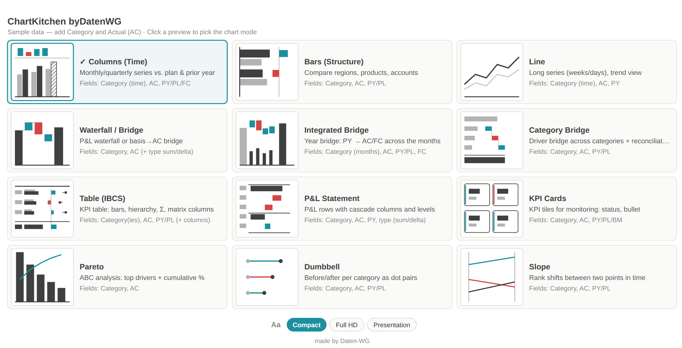
- While fields are missing, ChartKitchen shows a landing page with tile previews of every mode and the fields each one needs — clicking a tile picks the matching orientation.
Field roles
| Field role | Type | What for |
|---|---|---|
| Category | Grouping | Time axis (months) or structure (e.g. countries, products). Required; a second category forms a hierarchy in the table. |
| Actual (AC) | Measure | The actual value — the main measure, drawn filled. Required. |
| Previous Year (PY) | Measure | Prior-year value, drawn grey. Basis for the ΔPY variance panels. |
| Plan / Budget (PL) | Measure | Plan or budget value, drawn as an outline. Basis for the ΔPL variance panels. |
| Forecast (FC) | Measure | Forecast value — drawn hatched automatically. |
| Benchmark (BM) | Measure | Reference value per category (e.g. market average, target) — shown as a tick marker; basis for the KPI-card status light and the bullet. |
| Prior-month FC (revision) | Measure | Forecast from the previous cycle — selectable as a variance basis (FC revision: what has shifted since the last forecast?). |
| Line (combo) | Measure | Second measure as a line over the columns (e.g. margin %) with its own axis on the right. Columns mode only. |
| Stack series (Stacked) | Grouping | When filled, columns/bars stack by this series (AC per series, with a legend and a total label). |
| Columns (matrix) | Grouping | Table only: pivots the values into column groups (e.g. quarter → month, max. 2 levels) — with a collapsible column hierarchy like the Power BI matrix. |
| Filter info (footer) | Measure | Text measure with the current filter context (e.g. via CONCATENATEX/SELECTEDVALUE) — shown as a second footer when the filter footer is on. |
| Comments | Measure | Text measure: categories with a comment get a numbered marker, the text appears in the tooltip and the comment list. |
| Small Multiples | Grouping | Splits the chart into small tiles per group — with identical scaling (IBCS small multiples). |
| Waterfall type (sum/delta) | Grouping | Waterfall/P&L only: “sum” = absolute subtotal, “delta” = movement (P&L waterfall). |
| Forecast flag (0=actual · 1=FC · 2=preliminary) | Grouping | Alternative to the FC measure: a 1/0 column — rows flagged 1 are drawn as forecast (hatched), the AC measure runs through. |
3 · First comparison with PY
- Add the matching measure to the Previous Year (PY) role. The variance panels ΔPY absolute and ΔPY % appear above the base chart immediately — green when better, red when worse.
- For a plan comparison also bind Plan / Budget (PL); under Chart → Layout → Variance basis you choose what the panels compute against (Auto uses PL, otherwise PY).
- From here you change the mode under Chart → Layout → Orientation — everything that follows builds on that.
03The 13 modes
Columns
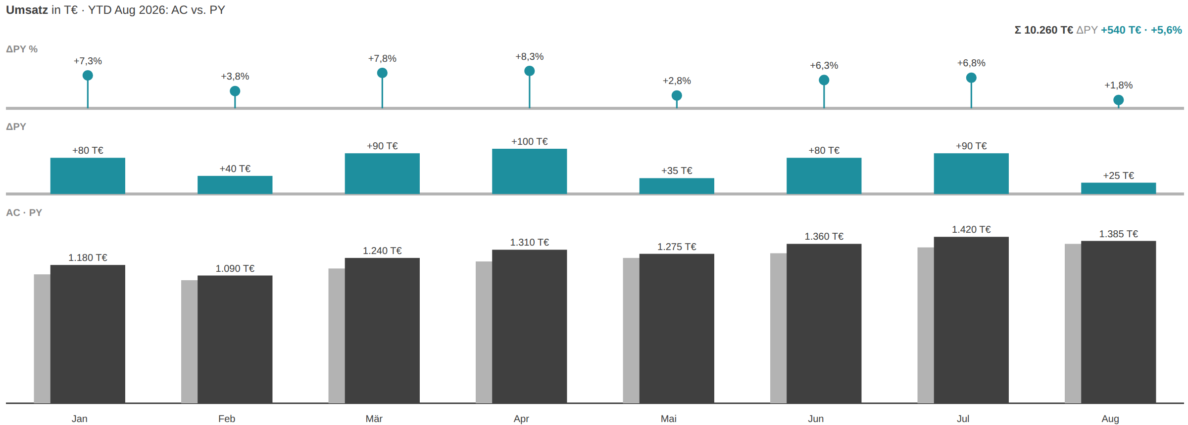
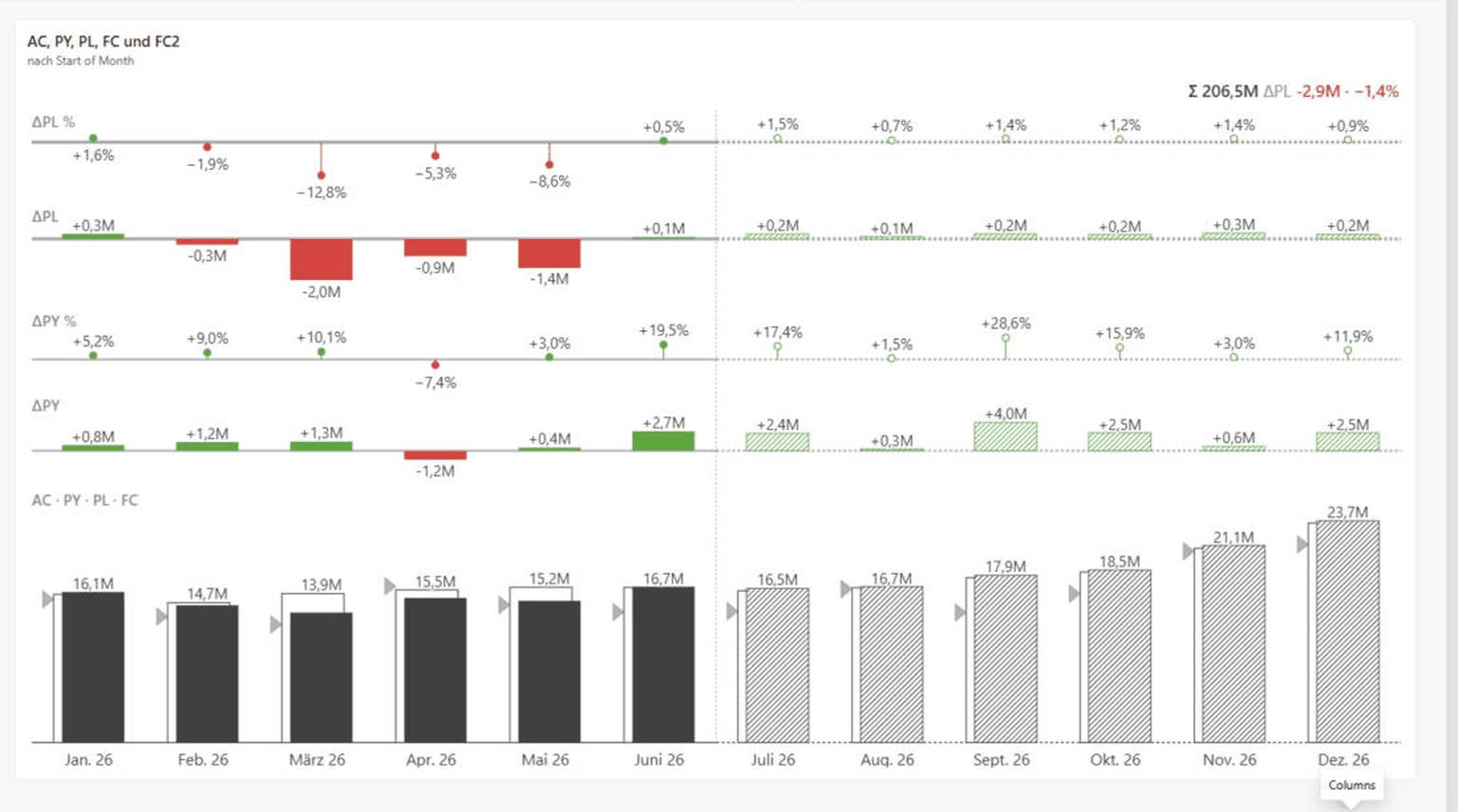
The default for time series: months or quarters as columns, AC filled, PY grey (or a triangle when PL is also bound). The variance panels ΔPY absolute and in percent sit above the columns. Use this mode when the time axis is manageable (up to about 24 points) and the deviation per period matters.
Bars
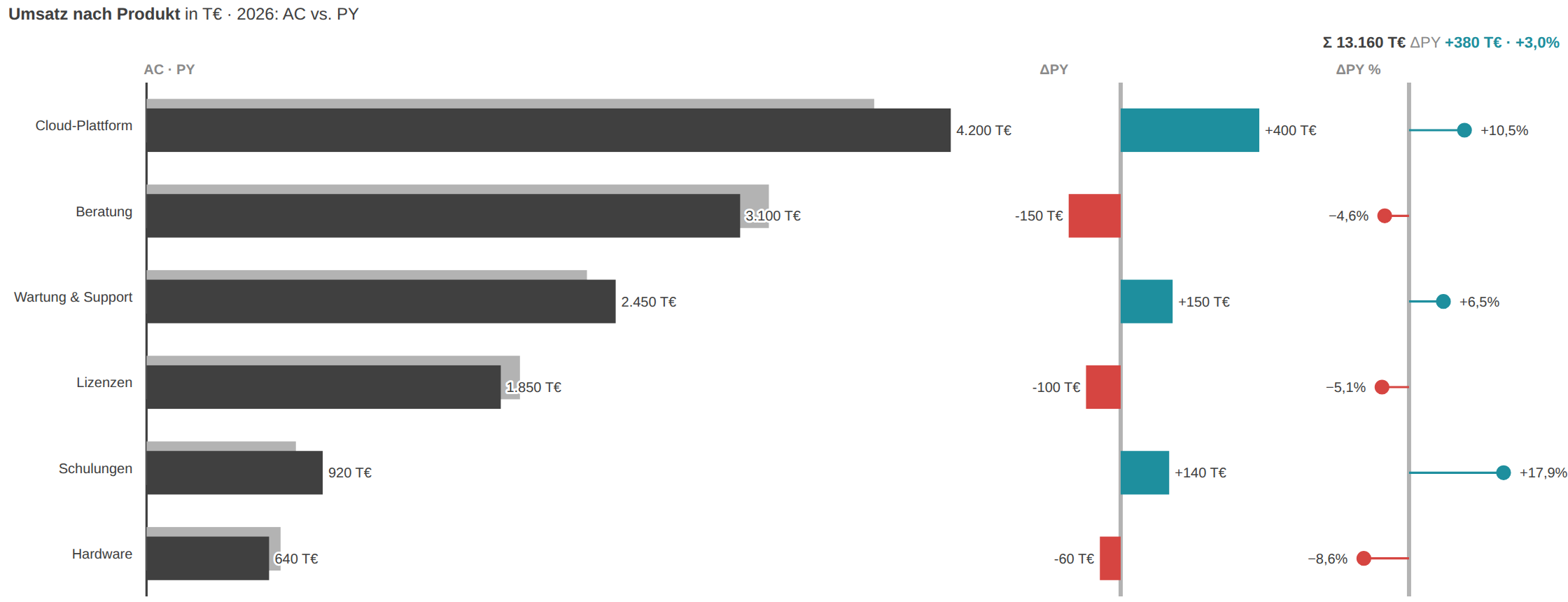
For structural comparisons without a time axis — products, regions, accounts. Categories appear as horizontal bars stacked top to bottom, sorted by AC descending by default, with ΔPY and ΔPY% panels on the side. Ideal when category names are long or there are many of them.
Line
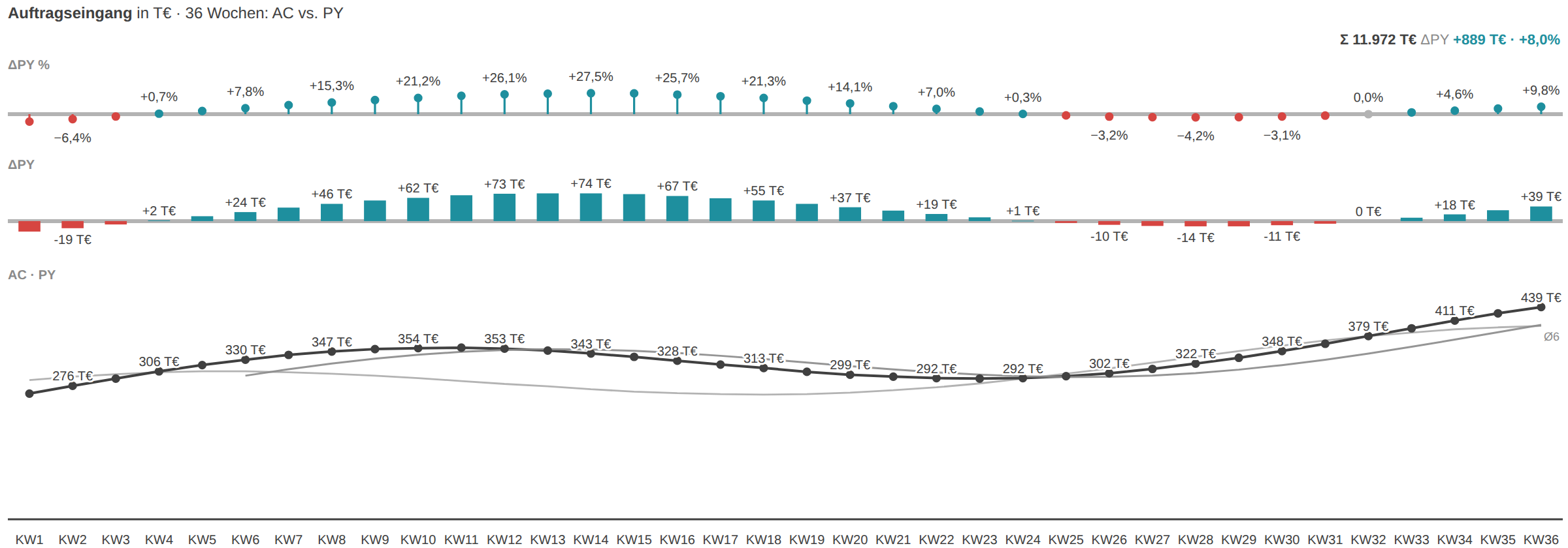
For long time series with many data points (weeks, days) where columns would get too dense. AC as a solid line, PY thin and grey; optionally a moving average over N periods for the trend. The focus is on the trajectory and turning points, not the single period.
Waterfall
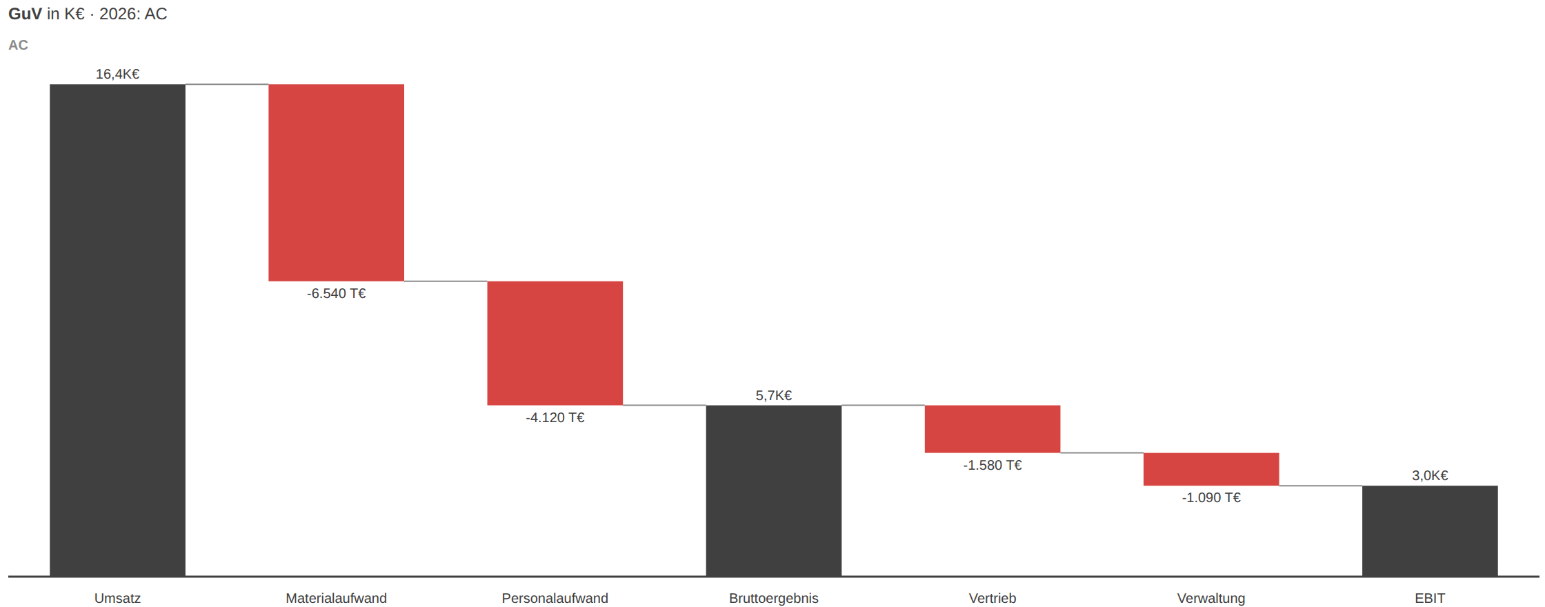
The classic P&L cascade: via the “Waterfall type” role (sum/delta), subtotals are drawn as solid columns and movements as floating bridge segments — from revenue to EBIT. Also usable as a plain basis→AC bridge. Use it when a result is built additively from contributions.
Integrated bridge
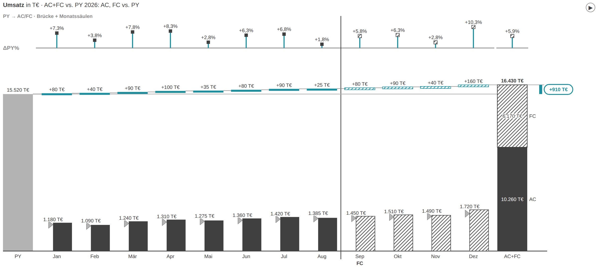
The year bridge: the PY total column on the left, the ΔPY cascade across the months in the middle, the stacked AC+FC total column on the right. It answers “how do we get from last year to today?” over time. It needs PY or PL as a basis and does not support all-negative values.
Category bridge
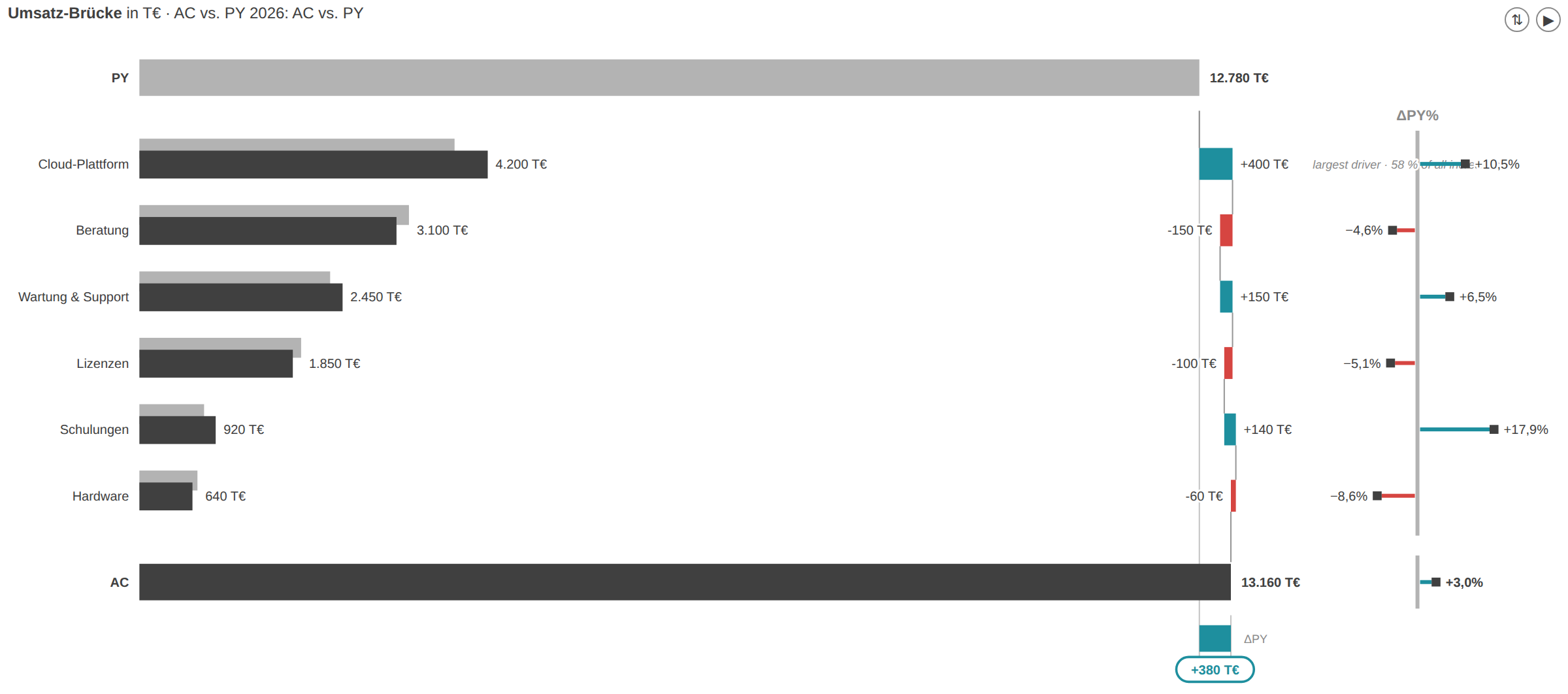
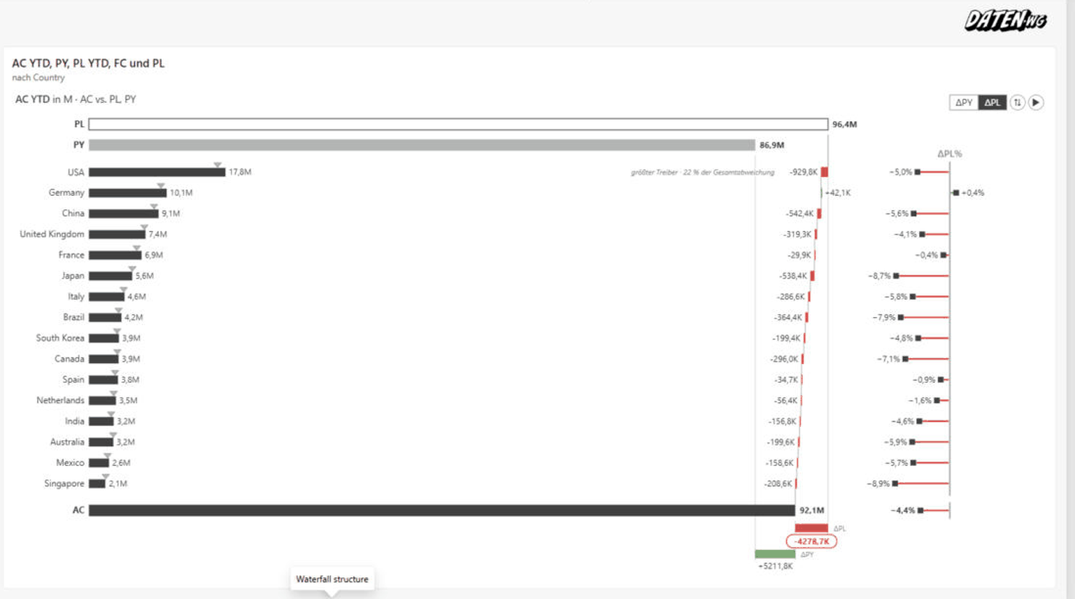
The driver bridge across categories: a PY row on top, each driver as an AC-PY bar plus a cascade segment and a ΔPY% pin, an AC reconciliation row at the bottom. You see at a glance which category drives the total variance. The biggest driver is flagged automatically with a note.
Table

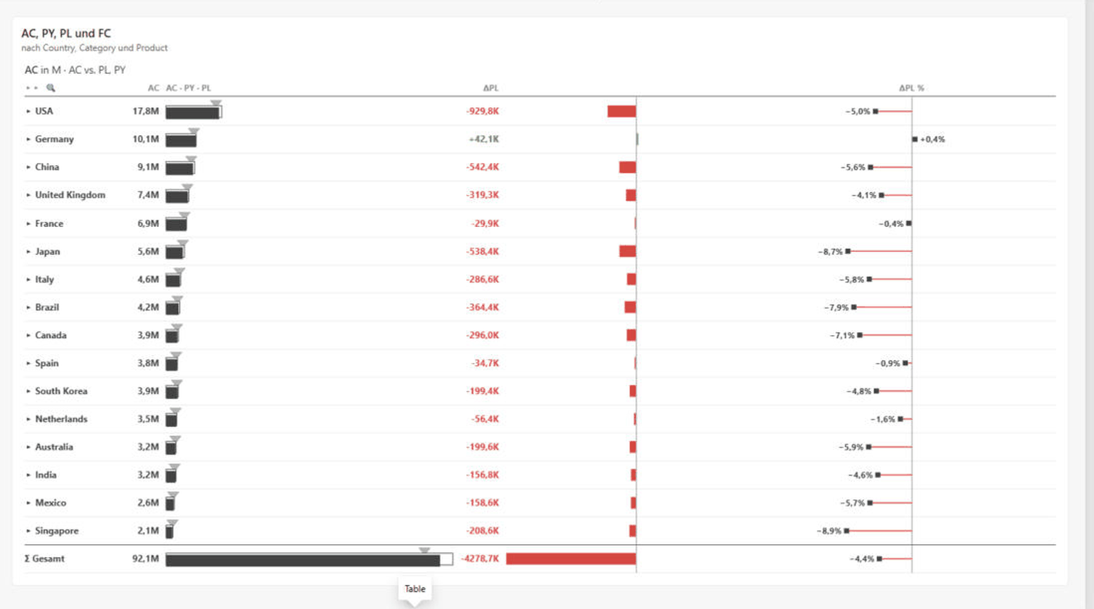
The flat IBCS value table: an AC-PY bar per row, a Δbasis bar column, Δbasis% pins and a Σ total row. It combines numeric precision with in-cell IBCS graphics and is the basis for hierarchies, result/skip rows and the matrix. Ideal for board- and print-ready KPI sheets.
Matrix

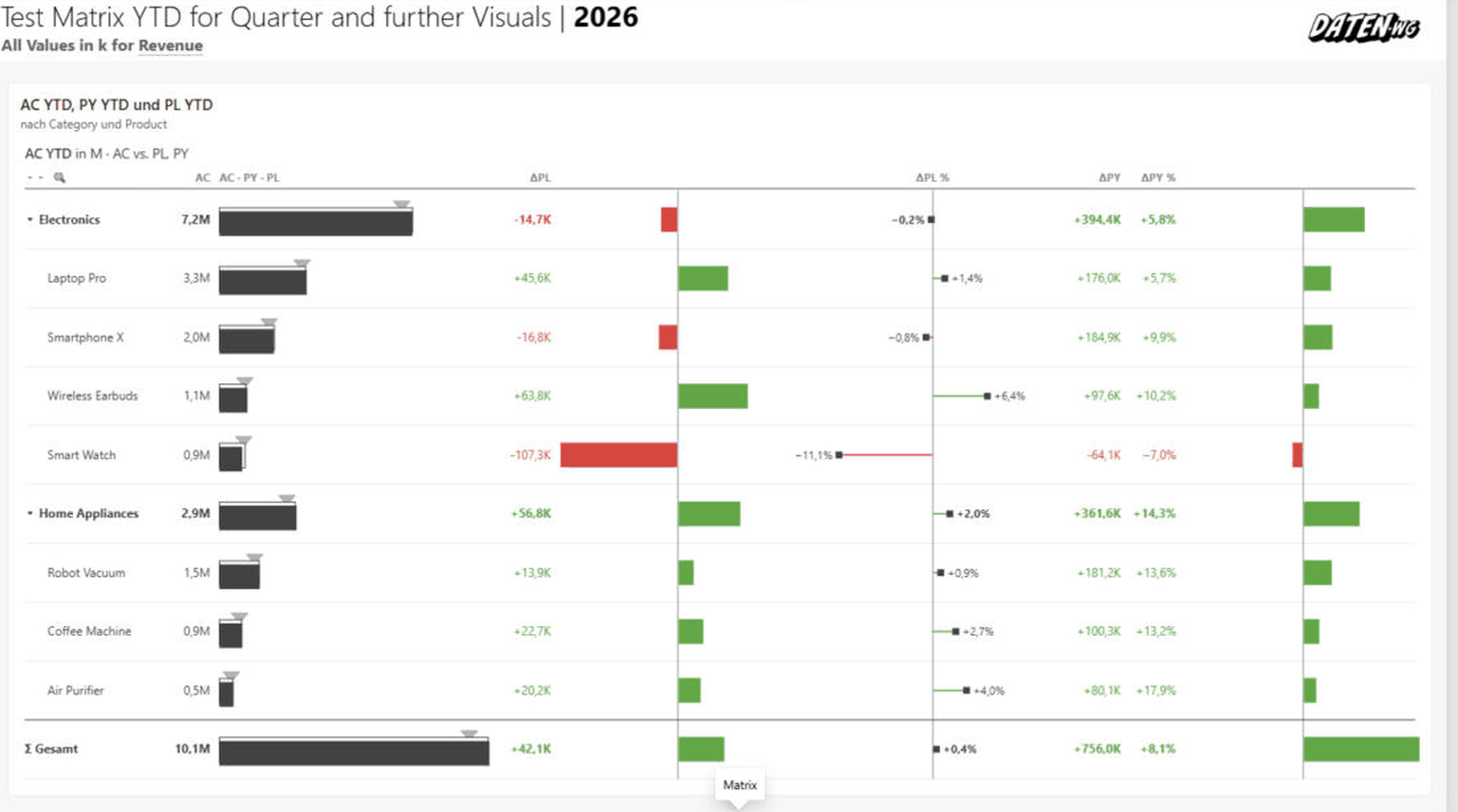
The table with the column role filled: row categories against a column hierarchy (e.g. quarter → month, max. 2 levels), value and Δbasis per block, a frozen Σ block on the right. Column groups collapse and expand, wide matrices scroll horizontally. For KPIs across two dimensions at once.
Pareto
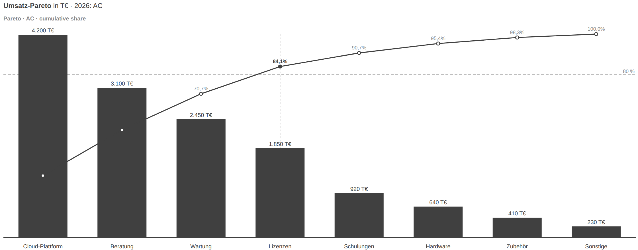
The ABC analysis: AC columns descending with a cumulative percentage line and an 80% reference marker. You immediately see which few categories make up the bulk. Use it for assortment, customer or root-cause analyses.
Dumbbell
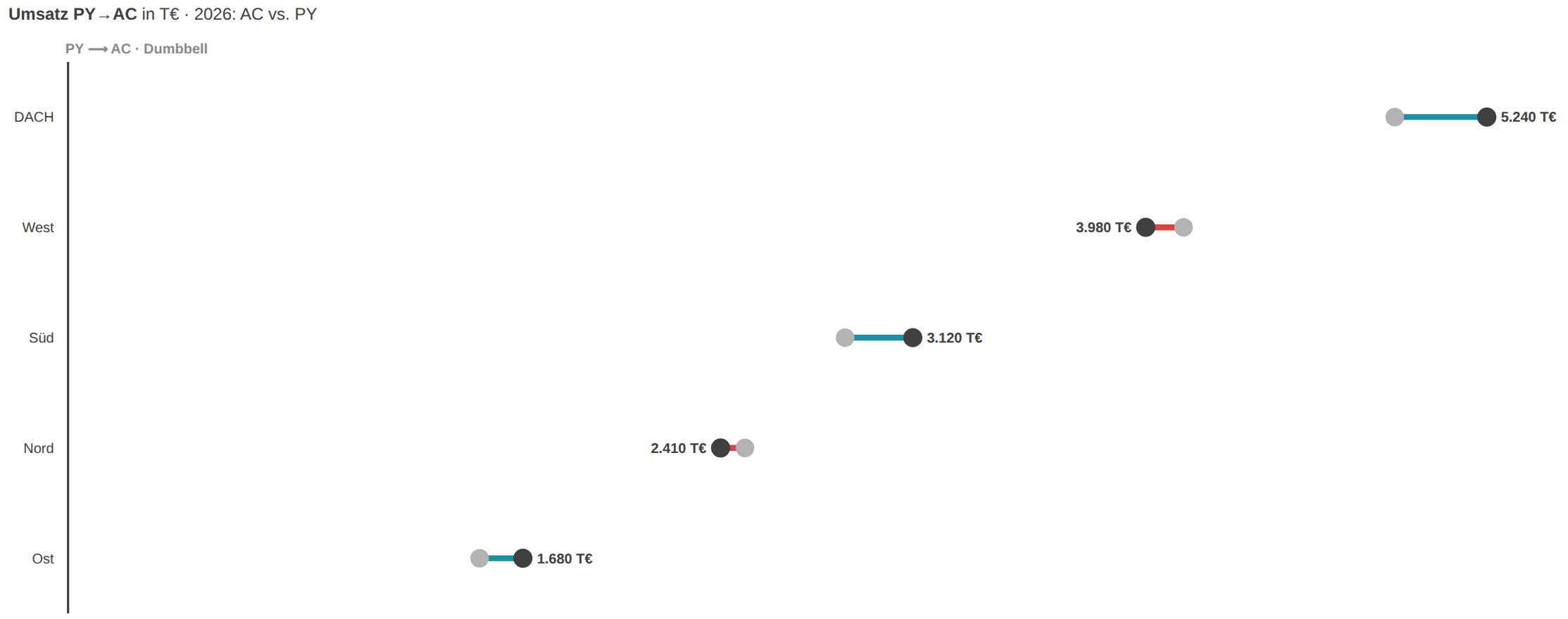
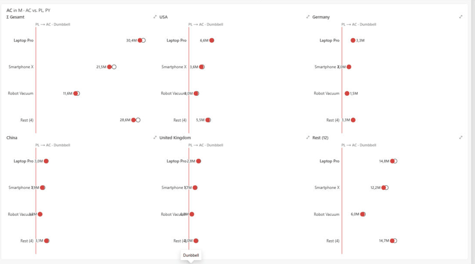
Before/after per category as a dot pair: a PY and an AC dot, the coloured connector shows the direction and size of the change. Calmer than two bar series when only two scenarios are compared. Needs AC and PY/PL per category.
Slope
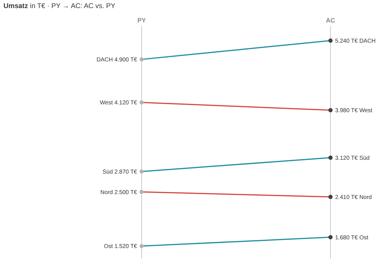
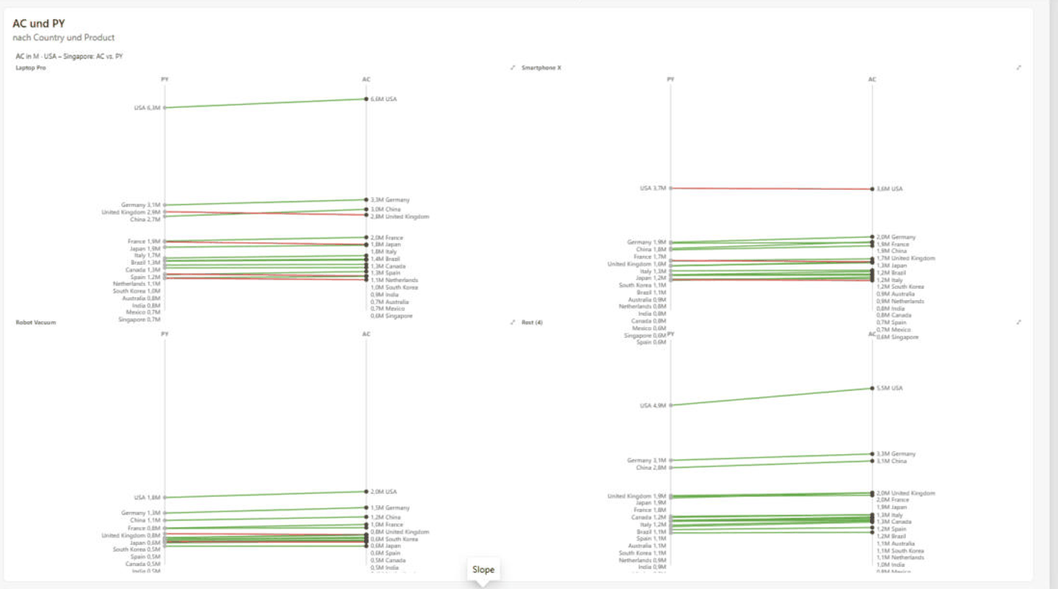
Rank shifts between two points in time: PY on the left, AC on the right, one line per category — slope and colour show risers and fallers. Ideal for telling the story of position changes in a ranking. Needs AC and PY/PL per category.
KPI cards
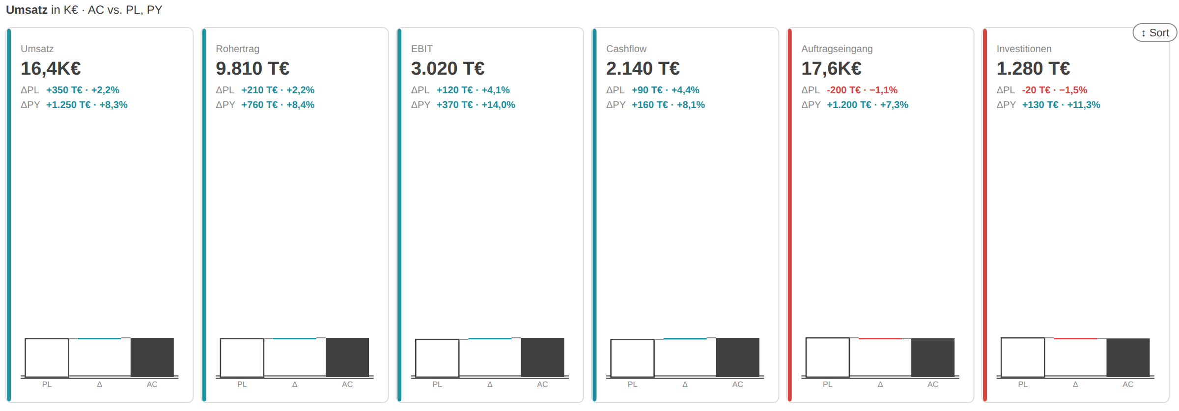
KPI tiles for monitoring: one card per metric with a large AC value, ΔPL and ΔPY rows and a mini bridge PL→Δ→AC. Optionally with a status light, background tint and a bullet against the benchmark. For overview pages and control-room walls.
P&L statement
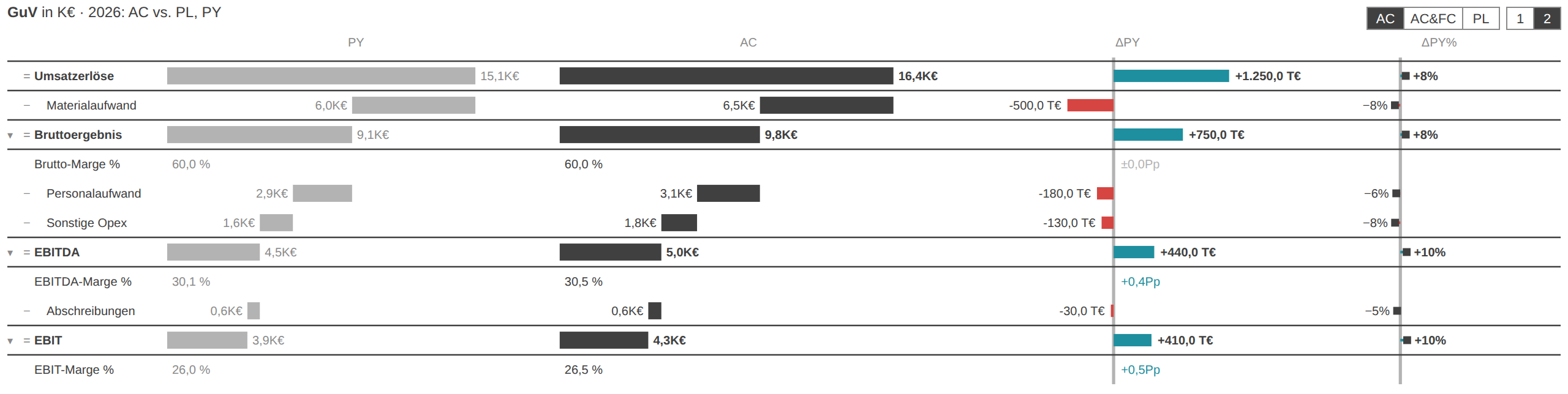
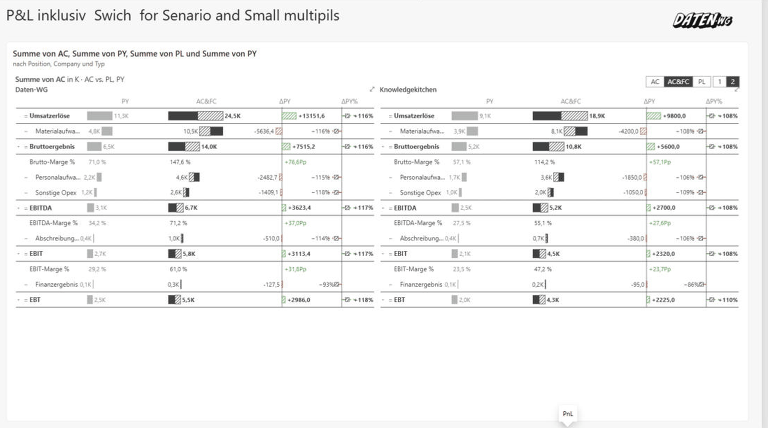
The full P&L statement: an income statement with subtotal, delta and margin rows, PY/AC cascade columns and ΔPY plus ΔPY% pins. Levels (subtotals only / all line items) and views (AC / AC+FC / PL) toggle via buttons. The closing mode for formal reporting. Needs PY (or PL) as a reference.
04ChartKitchen in action
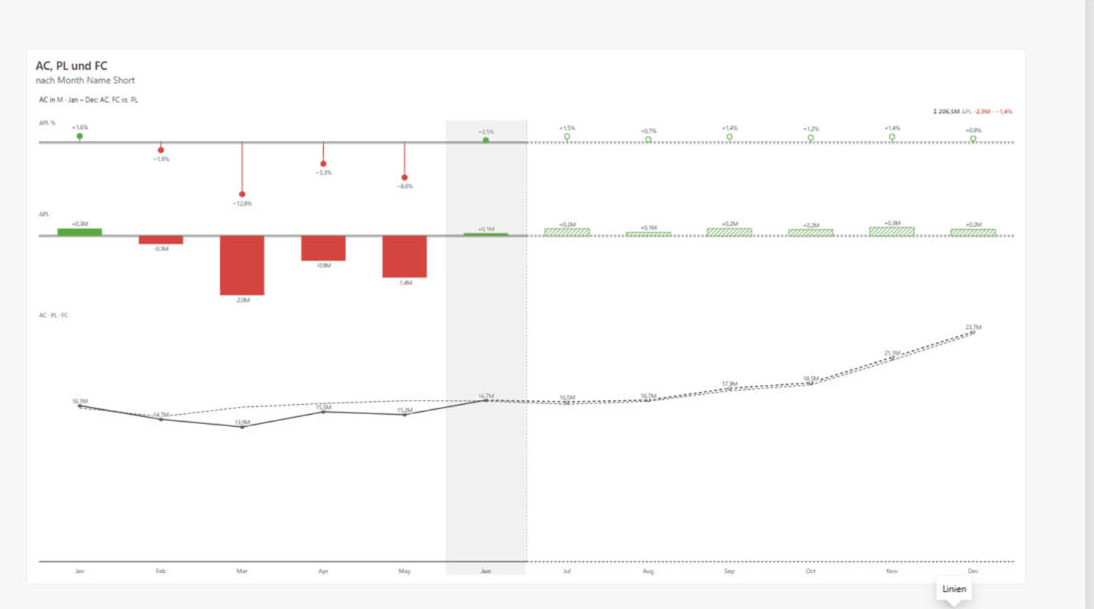
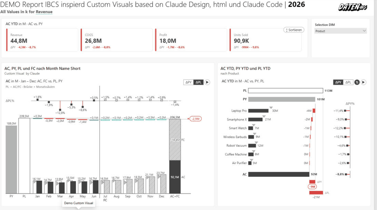
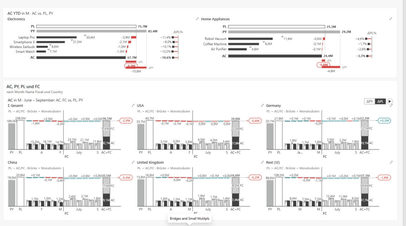
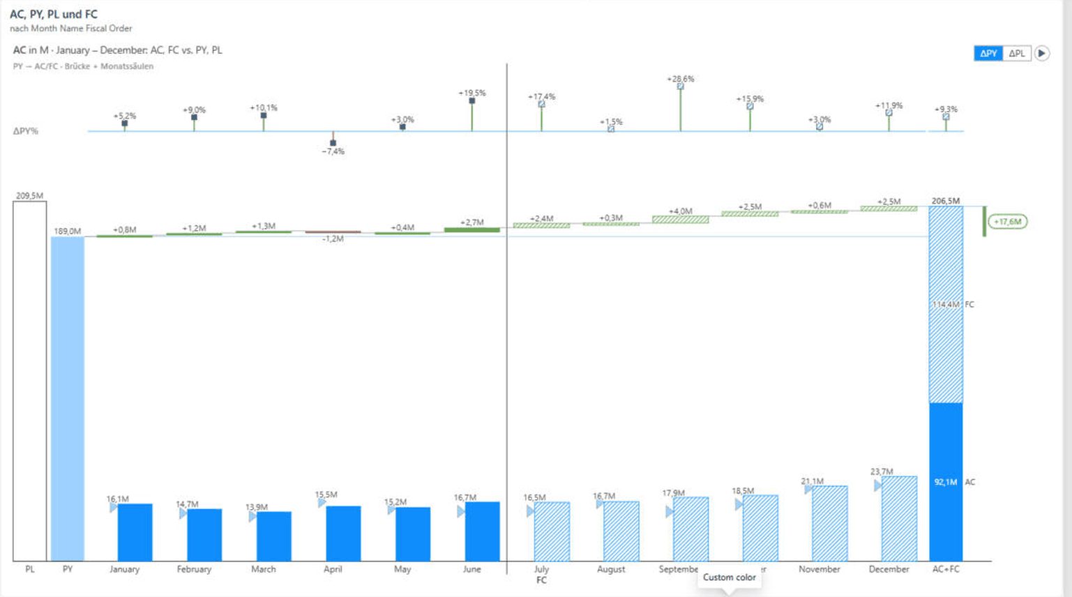
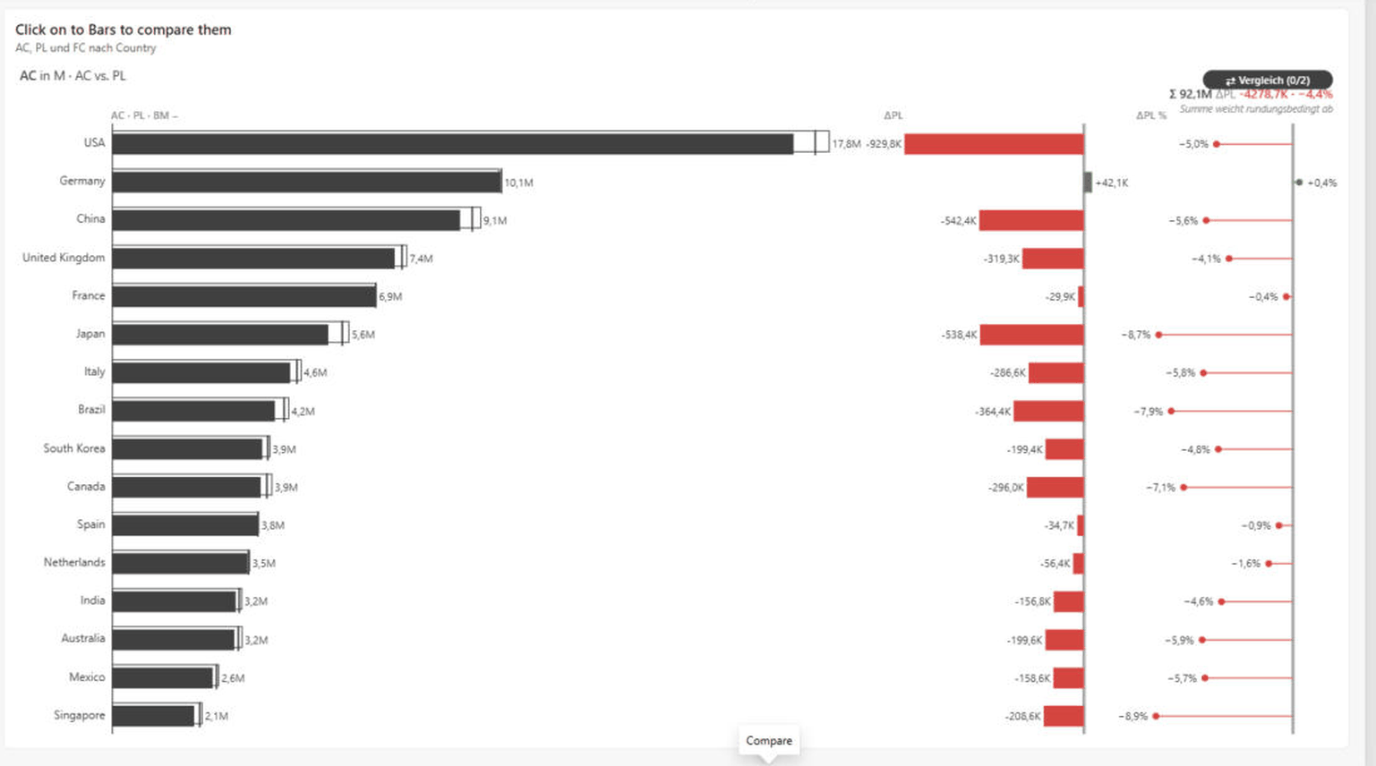
The following captures come straight from Power BI Desktop, with sample data from a real report. The other figures in this documentation are produced by the same renderer — here you see the visual as it works together in day-to-day reporting.
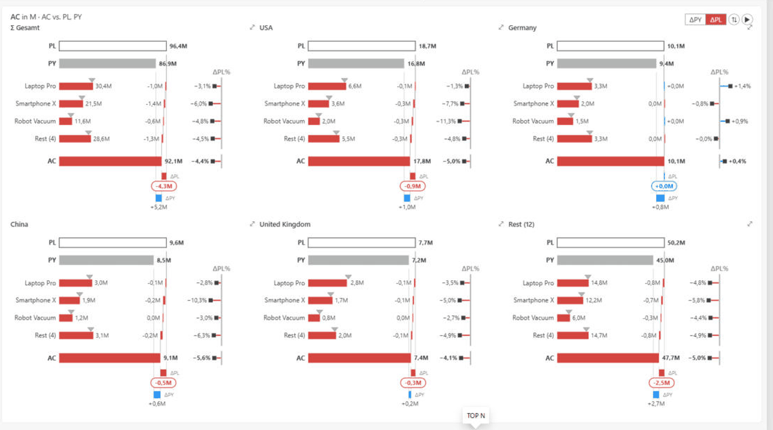
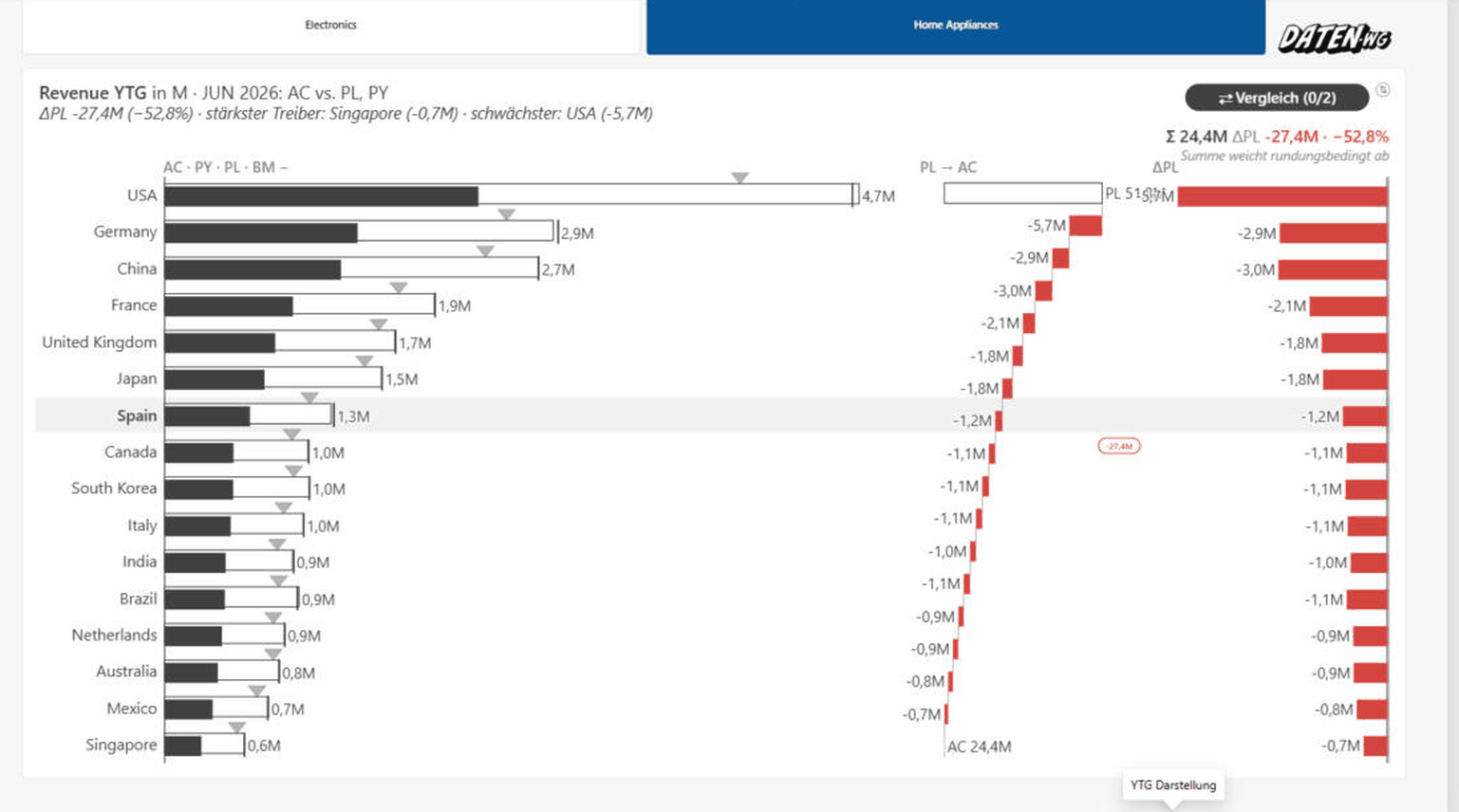
05Features in detail
Scenarios, forecast hatching & benchmark
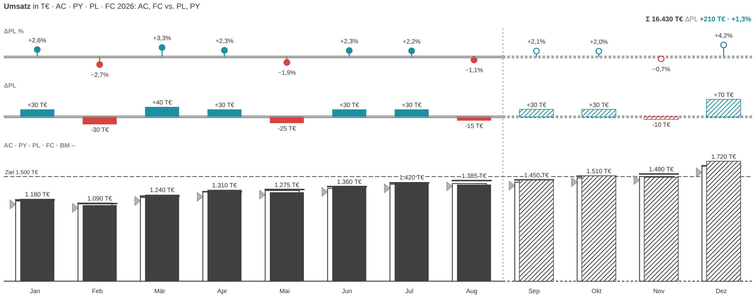
- Bind AC, PY, PL and FC to their field roles — all four appear in one chart.
- FC is drawn hatched automatically. As an alternative to the FC measure you can bind a 1/0 column to the “Forecast flag” role.
- With three scenarios (AC + PY + PL) IBCS shows PY as a grey triangle on the column. Turn it off under Chart → Layout → “PY as triangle”.
- For a target value per category fill the Benchmark role — it appears as a tick marker (triangle).
- For a fixed target or threshold line use Scale → Reference line (value + label) instead.
Small multiples
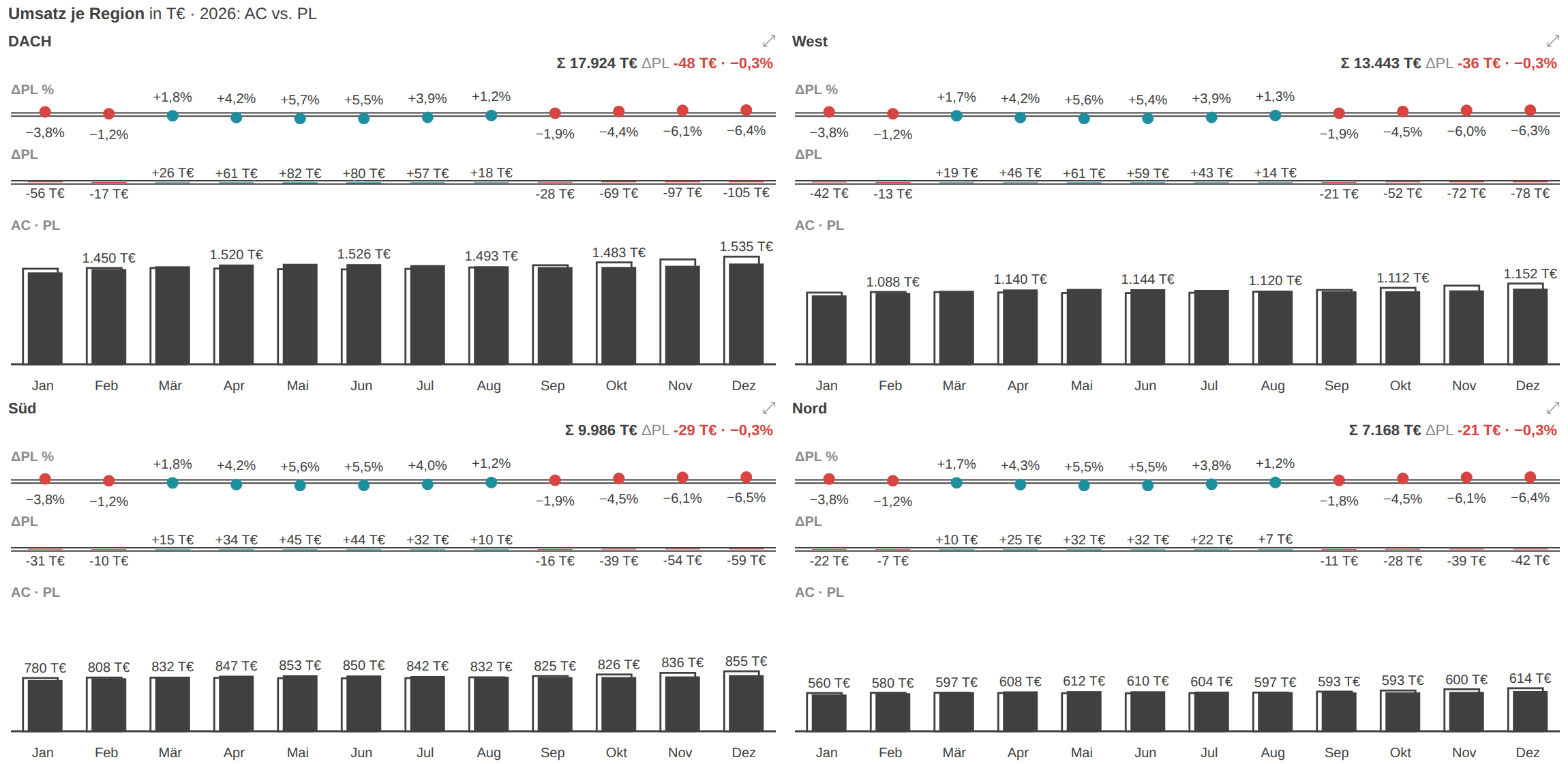
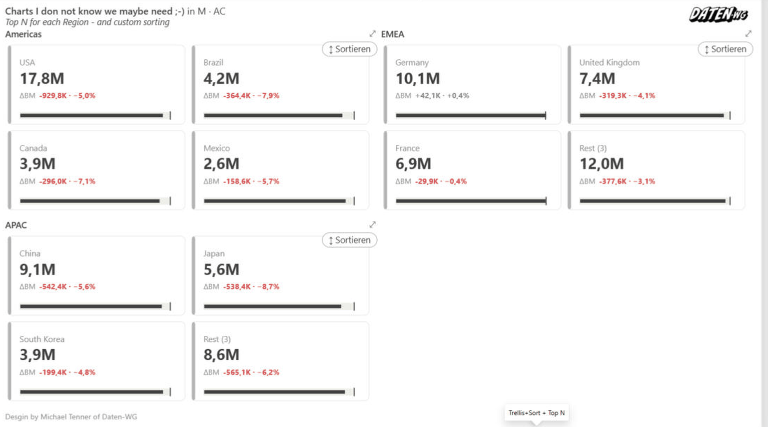
- Drag a grouping field (e.g. region) into the “Small Multiples” role. The visual splits into one tile per group on a shared scale (IBCS).
- Under Chart → Small Multiples you control a leading “Σ Total” tile, Top-N tiles (the rest is aggregated into “Other”) and a larger first tile.
- For the bridge modes (integrated/category bridge) force an identical scale with “Bridges: same scale for all tiles”; columns, bars and waterfall share it anyway.
- Clicking a tile’s zoom icon enlarges it temporarily.
Matrix: column groups, drill & horizontal scrolling
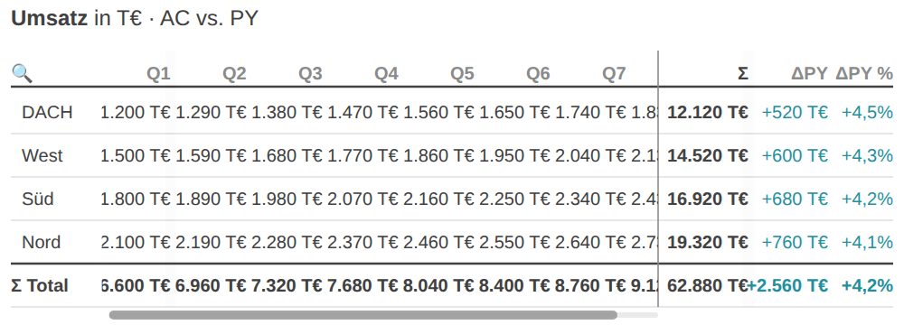
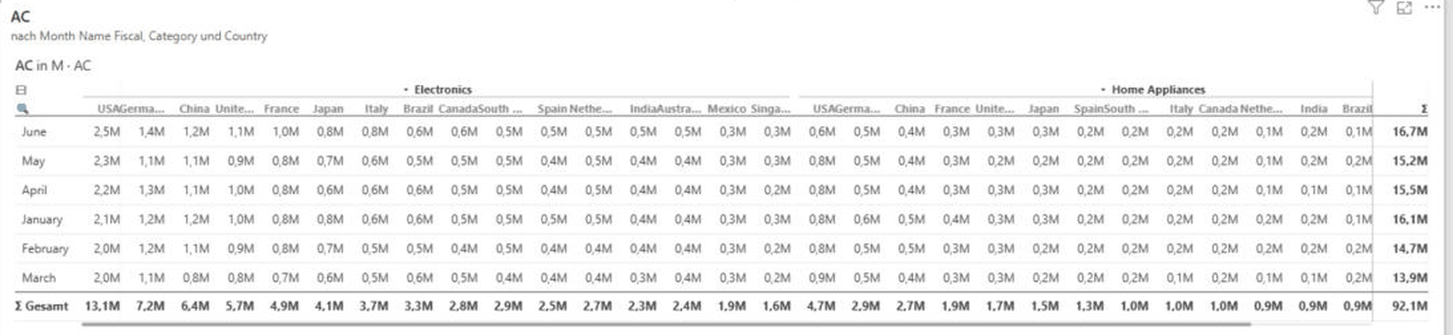
- In addition to the category, fill the “Columns (matrix)” role with up to two levels (e.g. quarter, month).
- Collapse and expand column groups by clicking the header; the ⊞/⊟ button in the header opens or closes all column groups at once, the double chevron all rows.
- When the matrix gets wider than the tile, the block strip becomes horizontally scrollable (Shift + mouse wheel or the scrollbar at the bottom). The name column on the left and the Σ block on the right stay frozen.
- Drag column widths at the handle on the right edge; a double-click fits the column to the longest visible content (auto-fit). The widths are stored in the report.
- On export/print the “… +n” hint remains, because a still image cannot scroll.
Two-row compact mode
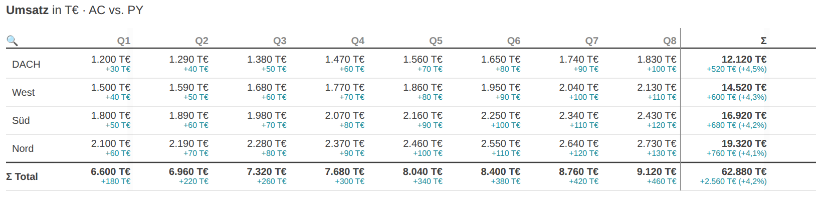
- Under Chart → Table → “Cell layout (matrix)” choose “Two rows”: the value sits large on top, the smaller Δ number directly below it in the same cell.
- This makes the matrix roughly half as wide and it often fits without horizontal scrolling.
- The Δ mini-bar is dropped in this layout; value columns (AC · PY · PL) stay as their own columns next to the value.
Value columns

- Under Chart → Table → “Value columns” switch between “AC only”, “AC + variance basis” and “AC · PY · PL”.
- The numeric reference values then sit next to the Δbasis bar column and the Σ block — for print- and board-ready tables without bar interpretation.
Σ row position

- Under Chart → Table → “Total (Σ) row position” choose “Top” (right under the header, IBCS) or “Bottom” (default, German P&L reading).
- In both cases the Σ row stays frozen while scrolling vertically.
Table comfort: zebra, grid, density, search, sorting
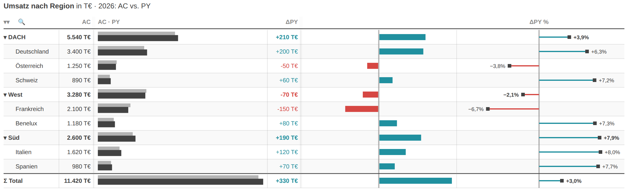
- Under Chart → Table set zebra stripes, row height (compact/normal/airy) and grid lines (horizontal/none/both).
- A second category field creates a hierarchy (e.g. region → country): expand single rows with the chevron, all of them with the double chevron ⇕ in the header.
- Use the magnifier icon to search the row names; clicking a column header sorts by that column (click again: ascending / off).
P&L statement & row types
- In the “P&L statement” mode (or waterfall) the “Waterfall type” role sets each row: “sum” = subtotal, “delta” = movement.
- Without that role you structure via lists under Chart → Table: result rows (bold anchor), exclude rows from totals, hide, indent (“of which”), chart only listed rows.
- Formula rows (e.g. “Margin = EBIT / Revenue”) and per-row number formats (e.g. “Margin = 0.0 %”) add calculated or mixed €/%/unit rows.
- Structure mode (Chart → Table → “Edit row structure”) sets these properties by clicking a row; the choice is persisted in the lists.
Comments
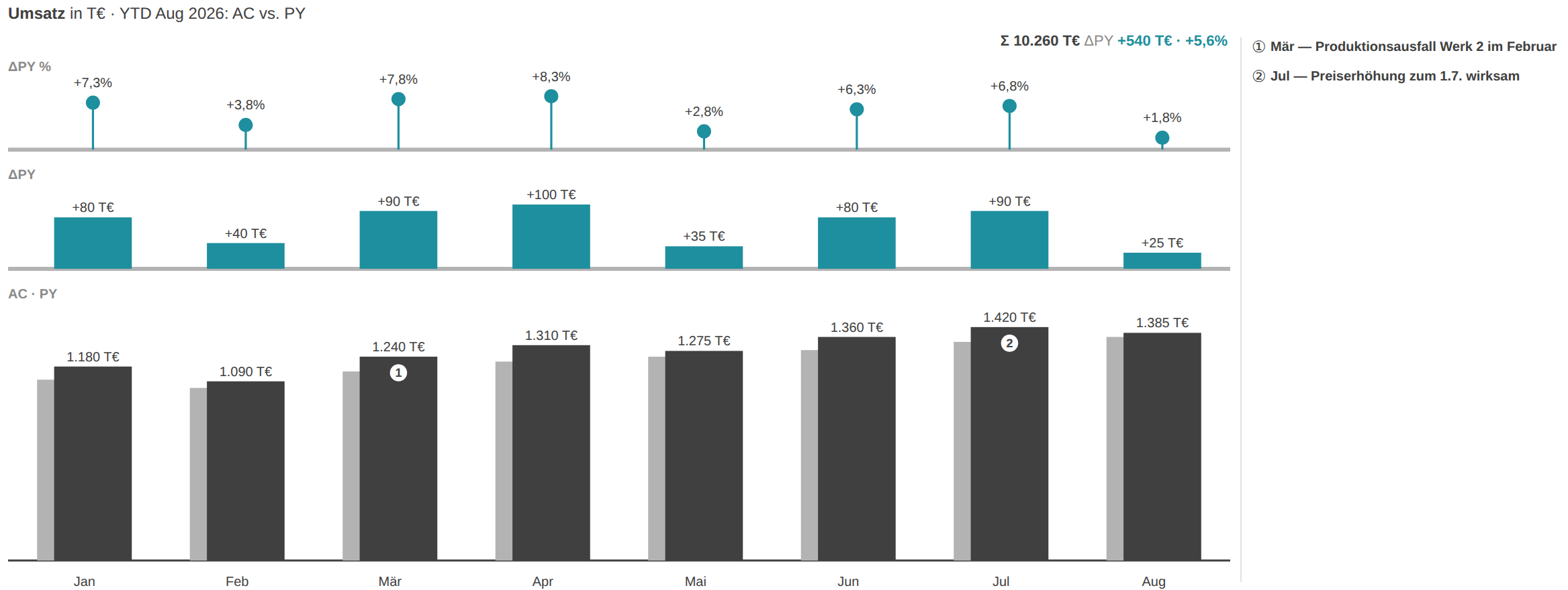
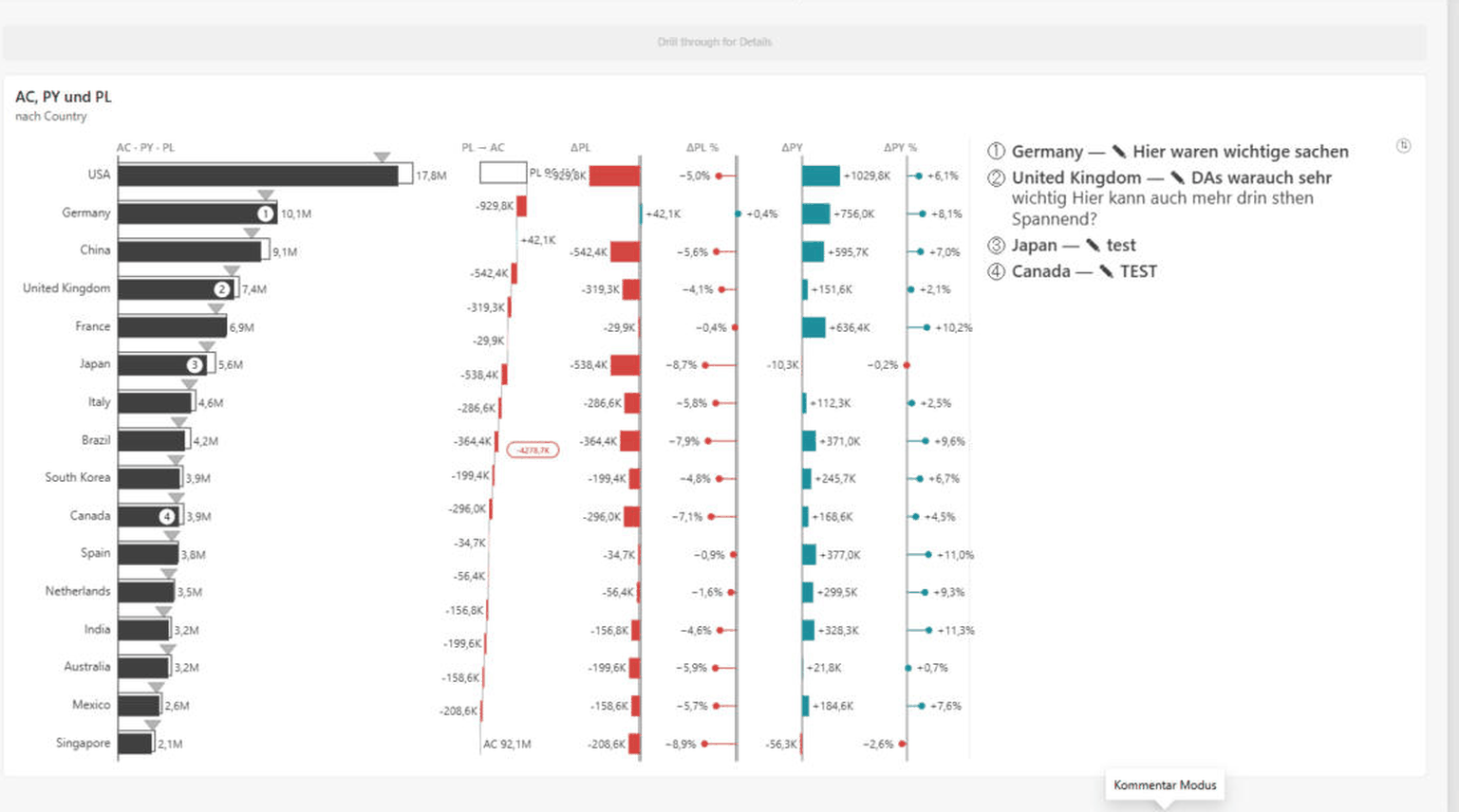
- Bind a text measure to the “Comments” role — categories with text get a numbered marker ① ②, the list sits to the right of the chart and stays visible on export.
- Alternatively enable comment mode under Comments → “Capture comments in chart”: clicking a category opens an input field, the text is stored in the report (bookmark-capable, travels with the PBIX).
- Show/hide the comment list and set its font size in the same “Comments” card.
Finance format
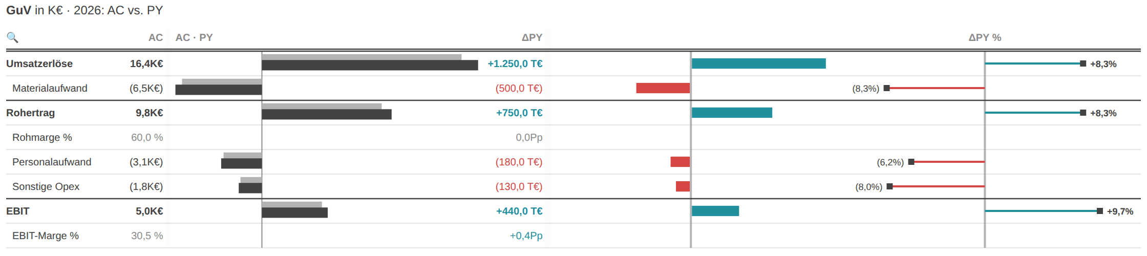
- Under Data labels → “Finance format (parentheses)” negative values are shown in parentheses instead of a minus sign — (1,234) — and zero as “–”.
- This applies to value and Δ labels including Δ % and matches the P&L row types subtotal, delta and margin.
IBCS title, footers & labels
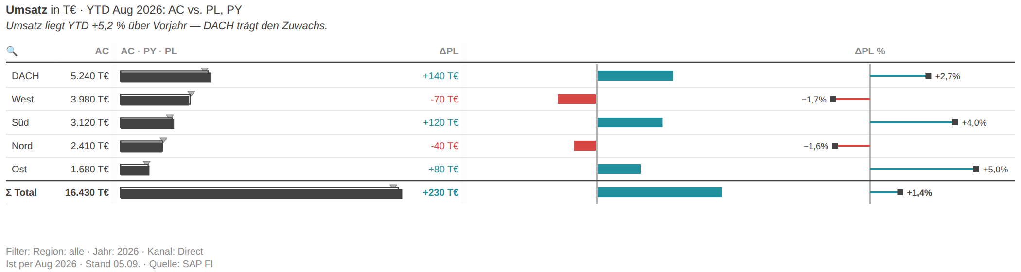
- The IBCS title (“KPI · unit · period: scenarios”) is built automatically; override the KPI name and period in the “IBCS title” card.
- Enter a message line (IBCS: SAY) at the top or let “Auto message” build it from the total variance and the biggest drivers.
- Two footers are available: “Footer (data status · source)” at the bottom left and the filter footer with the bound filter-info measure plus the display state (YTD, Top-N, sorting …).
- Scale all fonts centrally via Data labels → Size preset (Compact/Full HD/Presentation) and the “Scale all labels %” factor; label density controls the thinning.
Monitoring cards (status light & bullet)
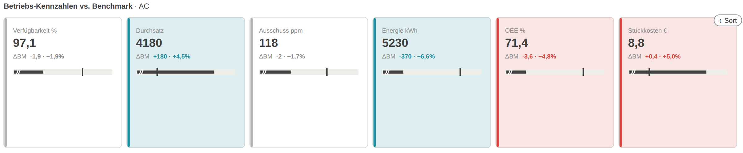
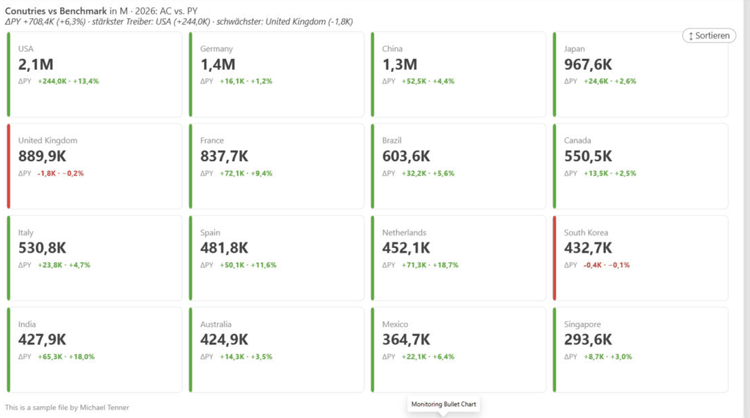
- In KPI-card mode, under Chart → KPI cards, set the status basis: against the variance basis (ΔPL/ΔPY) or against the bound benchmark measure.
- The background tint (traffic light) with its intensity and the highlight direction (both / only bad / only good) rate AC against that basis.
- Show the bullet against the benchmark (optionally zoomed to the target range) and the mini bridge as needed; you can sort by deviation (biggest top-left).
- The benchmark role must be filled for the benchmark rating.
Cross-filter, tooltips & bookmarks
- Clicking a category filters the other visuals on the page (cross-filter). Exceptions: while comment, compare or structure mode is active, clicks do not cross-filter.
- On hover, default and canvas tooltips show values, variances, series and comment; canvas tooltips (report-page tooltips) are supported.
- Interactive states are bookmark-capable: the variance basis, the YTD view, in-chart sorting, expanded rows/columns, captured comments and column widths travel with the report or the bookmark.
06Settings reference
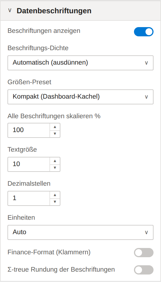
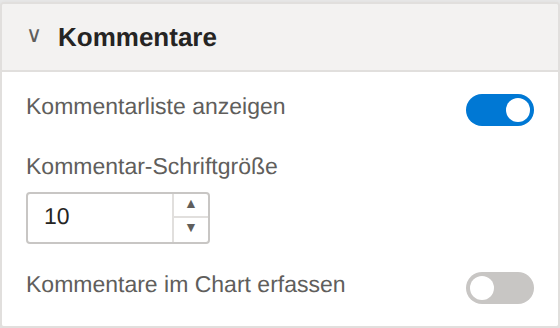
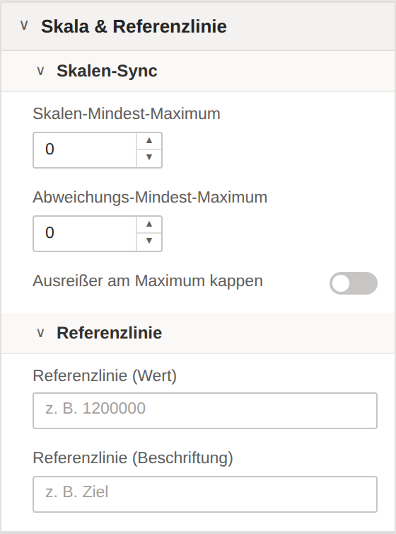
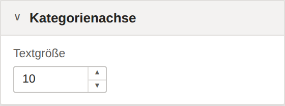
The following schematics show the structure and order of the format pane (naming as in Power BI). Each card and subgroup appears as a schematic sketch next to its settings table, so you can locate every toggle and dropdown in the pane itself. The German format pane is shown; the English pane is laid out identically.
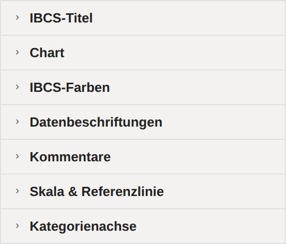
IBCS Title
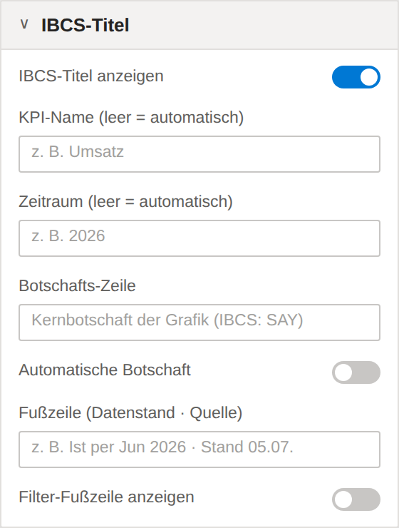
| Setting | Description | Options / default |
|---|---|---|
| Show labels | — | On / Off · default On |
| KPI name (auto if empty) | — | Free text · z. B. Umsatz |
| Period (auto if empty) | — | Free text · z. B. 2026 |
| Message line | — | Free text · Kernbotschaft der Grafik (IBCS: SAY) |
| Auto message | Automatically builds the message line (driver text) from the total variance and the biggest drivers when no custom message is entered. Off by default. | On / Off · default Off |
| Footer (data status · source) | Footer at the bottom left — e.g. data status and source: "Actuals as of Jun 2026 · status 05.07. · source: SAP FI". | Free text · z. B. Ist per Jun 2026 · Stand 05.07. |
| Show filter footer | Second footer with the filter context: shows the bound "Filter info" text measure (report filters are not exposed to custom visuals via API) plus the visual's own display state — YTD, Top-N, in-chart sorting, Σ exclusions, comparison. | On / Off · default Off |
Chart
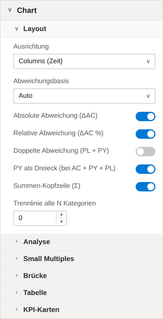
| Setting | Description | Options / default |
|---|---|---|
| Orientation | — | Options: Columns (Time) | Bars (Structure) | Line (Time, many points) | Waterfall / Bridge | Integrated Bridge (Time) | Category Bridge (Structure) | Table (IBCS) | Pareto (Structure) | Dumbbell (Structure) | Slope · Before/After | KPI Cards (Tiles) | P&L Statement (IBCS) · default „Columns (Time)“ |
| Variance basis | Basis for the variance panels. Auto: PL if available, otherwise PY. | Options: Auto | Previous Year (PY) | Plan (PL) | Prior-month FC (revision) · default „Auto“ |
| Absolute variance (ΔAC) | — | On / Off · default On |
| Relative variance (ΔAC %) | — | On / Off · default On |
| Dual variance (PL + PY) | Additionally shows the variance panels for the second basis — ΔPL and ΔPY at the same time (requires PY and PL). | On / Off · default Off |
| PY as triangle (AC + PY + PL) | IBCS notation with three scenarios: when AC, PY and PL are bound, the previous year is shown as a grey triangle (▶) at the column/bar edge at PY height instead of as a third column — less cluttered. Off = PY shown as a grey column again. | On / Off · default On |
| Total (Σ) header | Shows the total and the total variance as a header row. | On / Off · default On |
| Group separator every N categories | Draws a thin separator line after every N categories, across all panels — for structural comparisons with natural subgroups (e.g. regions). 0 = off. | 0–50 · default 0 |
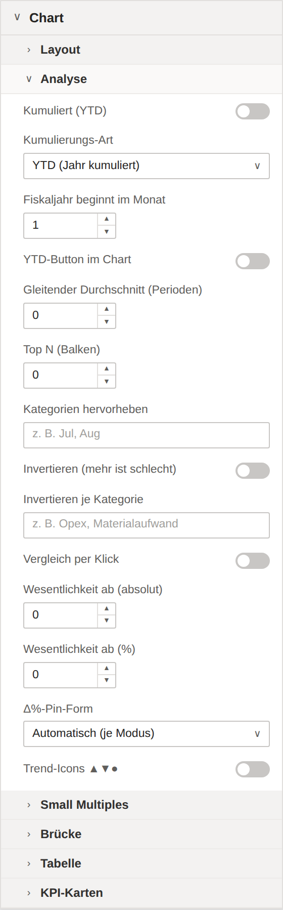
| Setting | Description | Options / default |
|---|---|---|
| Cumulative (YTD) | Switches all panels to a cumulative view: columns, Δbasis and Δbasis % show year-to-date values. | On / Off · default Off |
| Cumulation kind | YTD resets at the start of the fiscal year, QTD at each quarter start, R12 sums the last 12 periods on a rolling basis. Month detection uses the category labels (Jan…Dec, 01…12). | Options: YTD (year to date) | QTD (quarter to date) | R12 (rolling 12 periods) · default „YTD (year to date)“ |
| Fiscal year starts in month | 1 = January … 12 = December. Determines where YTD/QTD reset (e.g. 4 for a fiscal year starting in April). | 1–12 · default 1 |
| YTD button in chart | Shows a clickable "YTD" button at the top right of the chart (Columns/Line) — the end user toggles the cumulative view directly in the report; the choice is persisted. Off by default. | On / Off · default Off |
| Moving average (periods) | Thin overlay line with a moving average over N periods (Columns/Line). 0 = off. | 0–24 · default 0 |
| Top N (bars) | Structure modes (Bars, Category bridge, Table, Dumbbell, KPI cards): shows the N largest categories, the rest is aggregated. 0 = all. | 0–50 · default 0 |
| Highlight categories | Comma-separated category names to emphasize (IBCS EMPHASIZE), e.g. the current month. | Free text · z. B. Jul, Aug |
| Invert (higher is bad) | For cost KPIs: a higher value is bad (red), a lower value is good (green). | On / Off · default Off |
| Invert per category | Comma-separated categories whose rating is reversed (e.g. cost rows next to revenue rows in KPI cards or the P&L table). Applies in addition to the global invert switch. | Free text · z. B. Opex, Materialaufwand |
| Compare on click | Columns/Bars only: clicking two columns/bars shows the difference (absolute + %) as an overlay — clicks then no longer cross-filter. Clicking empty space resets. Off by default. | On / Off · default Off |
| Materiality from (absolute) | Materiality threshold: variances below this absolute amount are shown in grey instead of red/green (panels, waterfall steps, table). 0 = off. | from 0 · default 0 |
| Materiality from (%) | Materiality threshold in percent: variances below this Δ % are shown in grey. If both thresholds are set, a variance must exceed both to be colored. 0 = off. | 0–100 · default 0 |
| Δ%-pin shape | Shape of the lollipop head of the Δ% pins. "Automatic" keeps the previous style per mode (Columns/Bars/Waterfall round, bridges and table square); "Round" or "Square" unify all modes. | Options: Automatic (per mode) | Round | Square · default „Automatic (per mode)“ |
| Trend icons ▲▼● | Prefixes the Δ values in the table and KPI cards with direction arrows: ▲ increase, ▼ decrease, ● immaterial (below the materiality threshold). Also readable in black-and-white print and for color-blind users — color still rates good/bad. | On / Off · default Off |
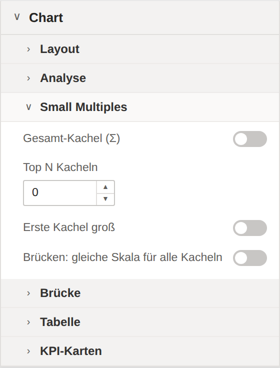
| Setting | Description | Options / default |
|---|---|---|
| Total tile (Σ) | Prepends a "Σ Total" tile — the sum across all groups, on the same scale (IBCS). | On / Off · default Off |
| Top N tiles | Shows only the N largest groups (by total AC) as tiles — the rest are aggregated into a "Remainder" tile. 0 = all. | 0–24 · default 0 |
| First tile large | Gives the first tile (e.g. "Σ Total" or the largest group) more room — all tiles keep the same scale (IBCS CT 13). | On / Off · default Off |
| Bridges: same scale for all tiles | Also scales the bridge modes (Integrated bridge, Category bridge) identically across all tiles (IBCS). Default: off — each bridge tile scales on its own. Columns, bars and waterfall always share the scale. | On / Off · default Off |
| Setting | Description | Options / default |
|---|---|---|
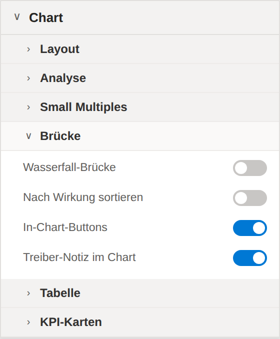
| Waterfall bridge | Columns/Bars only: shows the categories as a waterfall bridge from the basis (PY/PL) to AC with connecting lines instead of individual bars. Optional — off by default. | On / Off · default Off |
| Sort by impact | Waterfall bridge only: sorts the categories by variance size (biggest driver first). A Top-N remainder row stays at the end. Also toggleable by clicking the ⇅ symbol in the chart. | On / Off · default Off |
| In-chart buttons | Integrated/Category bridge: shows clickable buttons at the top right of the chart — ΔPY/ΔPL reference toggle, ⇅ sorting and ▶ build-up animation. The end user can switch the variance basis directly in the report; the choice is persisted. | On / Off · default On |
| Driver note in chart | Category bridge: italic note at the biggest driver ("biggest driver · n % of the total variance") — overlays the row area, can be turned off here. | On / Off · default On |
| Setting | Description | Options / default |
|---|---|---|
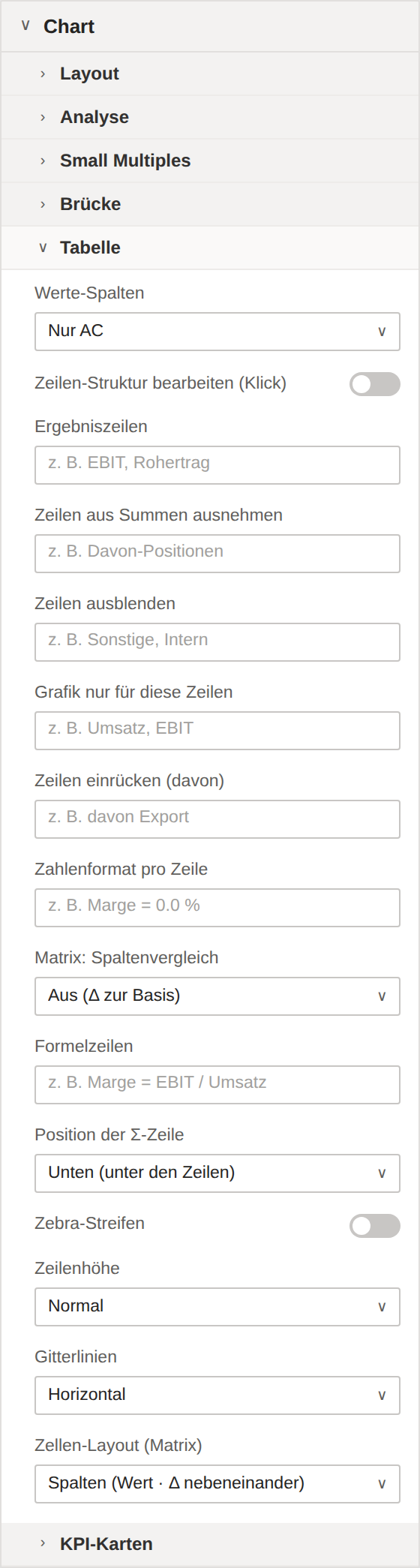
| Value columns | Extra number columns next to AC: the variance basis (PY or PL, depending on the comparison basis) or both reference scenarios — for print- and board-ready tables without bar interpretation. | Options: AC only | AC + variance basis | AC · PY · PL · default „AC only“ |
| Edit row structure (click) | Edit mode: clicking a row opens a small menu with "Invert", "Result row" and "Exclude from totals" — the one-click P&L without changing the data model. The choice is persisted in the lists below; turn off again to report. | On / Off · default Off |
| Result rows | Comma-separated row names that are formatted as result rows (bold, separator line, excluded from Σ; anchors in the waterfall) — an alternative to the waterfall type role. | Free text · z. B. EBIT, Rohertrag |
| Skip rows (exclude from totals) | Comma-separated row names that do not flow into the Σ row, the scales and the waterfall cascade (e.g. memo items). The row stays visible but is shown subtly. | Free text · z. B. Davon-Positionen |
| Hide rows | Comma-separated row names that are only hidden — the Σ row, scales and formulas still compute with them (unlike "Exclude from totals"). Can also be set by clicking in structure mode. | Free text · z. B. Sonstige, Intern |
| Chart only these rows | Comma-separated row names: when filled, only these rows show the bar/pin graphics — all others stay pure number rows. Empty = graphics everywhere. The Σ row always keeps its graphic. | Free text · z. B. Umsatz, EBIT |
| Indent rows (davon) | Comma-separated row names shown indented and subtly as "of which:" items — without a hierarchy field. Usually combined with "Exclude from totals". | Free text · z. B. davon Export |
| Row number formats | Number format per row, semicolon-separated: "Margin = 0.0 %; Quantity = #,0". Percent multiplies by 100; values appear unscaled (no k€ division) — for mixed €, % and unit rows. | Free text · z. B. Marge = 0.0 % |
| Matrix: column comparison | Comparison within the matrix columns: "Δ vs. previous column" replaces the Δbasis per block with the change to the previous column (period comparison Q2 vs. Q1, Mar vs. Feb …). | Options: Off (Δ vs. basis) | Δ vs. previous column · default „Off (Δ vs. basis)“ |
| Formula rows | Calculated rows, semicolon-separated: "EBIT = Revenue - Costs" adds a subtotal row, "Margin = EBIT / Revenue" a % row. Operands are row names; please surround operators with spaces. Formula rows do not flow into the Σ row. | Free text · z. B. Marge = EBIT / Umsatz |
| Total (Σ) row position | Where the Σ total row sits: “Bottom” (default, German P&L reading) below all rows, “Top” right under the header (IBCS). Stays frozen while scrolling. | Options: Bottom (below rows) | Top (below header) · default „Bottom (below rows)“ |
| Zebra stripes | Shades every second data row with a very subtle background — easier row tracking in wide tables. Off in high-contrast mode. Off by default. | On / Off · default Off |
| Row density | Row height: “Compact” for dense tables, “Normal” (default) as before, “Airy” for more whitespace. Scales only the cap; very tall visuals stay bounded. | Options: Compact | Normal | Airy · default „Compact“ |
| Grid lines | Separator style: “Horizontal” (default) row lines only, “None” for a calm look, “Horizontal + vertical” adds subtle column/block dividers. | Options: Horizontal | None | Horizontal + vertical · default „Horizontal“ |
| Cell layout (matrix) | Matrix only: “Columns” (default) shows the value and Δbasis side by side. “Two rows” puts the value large on top and the smaller Δ number directly below it in the same cell — the matrix becomes roughly half as wide. The Δ mini-bar is dropped; reference (value) columns stay as their own columns next to the value. | Options: Columns (value · Δ side by side) | Two rows: value on top, Δ below · default „Columns (value · Δ side by side)“ |
| Setting | Description | Options / default |
|---|---|---|
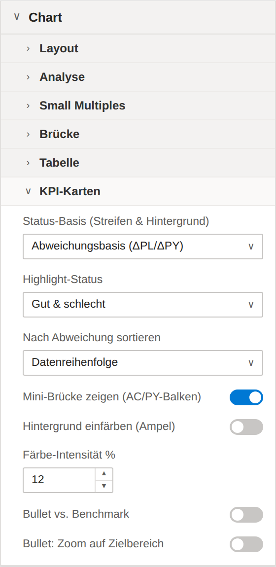
| Status basis (stripe & background) | What the stripe and background traffic light rate against: the comparison basis (ΔPL or ΔPY) or the bound benchmark measure — for monitoring against targets/thresholds. | Options: Variance basis (ΔPL/ΔPY) | Benchmark (BM) · default „Variance basis (ΔPL/ΔPY)“ |
| Highlight status | Which direction is highlighted in color: both (traffic light), only bad (problem monitoring — positives stay neutral) or only good (success board). Applies to stripes, background, Δ rows and bullet. | Options: Good & bad | Only bad | Only good · default „Good & bad“ |
| Sort by deviation | Orders the cards by the color-relevant variance (benchmark or ΔPL/ΔPY, depending on the status basis): biggest variance top-left — for maximum focus. "Data order" leaves them as in the model. | Options: Data order | Biggest deviation first | Worst first (bad on top) | Best first (good on top) · default „Data order“ |
| Show mini bridge (AC/PY bars) | Shows the small bar bridge basis → Δ → AC at the bottom of the card. Off: pure number card (large value + Δ rows), calmer for dense KPI walls. | On / Off · default On |
| Tint card background | Subtly tints the card background: slightly green when better, slightly red when worse than the status basis — neutral (below materiality) stays uncolored. For monitoring walls; off in high-contrast mode. | On / Off · default Off |
| Tint intensity % | Opacity of the background tint in percent (4–40). Default 12 — stronger for control-room monitors, subtler for board reports. | 4–40 · default 12 |
| Bullet vs. benchmark | Small bullet chart on the card: AC bar on a light band, benchmark as a tick — below the number (stacked layout) or next to the Δ rows (flat layout). Requires the benchmark role. | On / Off · default Off |
| Bullet: zoom to target range | Spreads the bullet across the range around AC and benchmark instead of starting at zero — KPIs close to target (97 vs. 99) become distinguishable. The axis break at the left bar end marks the truncated scale. | On / Off · default Off |
IBCS Colors
| Setting | Description | Options / default |
|---|---|---|
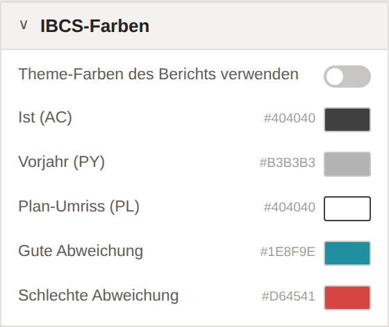
| Use report theme colors | Takes the good/bad and neutral colors from the report theme instead of the color pickers below. | On / Off · default Off |
| Actual (AC) | — | default #404040 |
| Previous Year (PY) | — | default #B3B3B3 |
| Plan outline (PL) | — | default #404040 |
| Good variance | The default is the DatenWG teal (#1E8F9E) instead of classic green — the blue component keeps "good" clearly distinguishable from red even with red-green color deficiency. Overridable here. | default #1E8F9E |
| Bad variance | — | default #D64541 |
Data Labels
| Setting | Description | Options / default |
|---|---|---|
| Show labels | — | On / Off · default On |
| Label density | Controls the thinning of value labels: "Automatic" hides them when space is tight (previous behavior), "All" labels every point (may overlap), "First · last · extremes" shows only the first/last value plus minimum and maximum. | Options: Automatic (thin out) | All | First · last · extremes · default „Automatic (thin out)“ |
| Size preset | Scales all fonts in the visual at once: Compact ×1 (default) · Full HD ×1.5 (recommended for 1080p reports) · Presentation ×2. | Options: Compact (dashboard tile) | Full HD (1080p) | Presentation (4K / projector) · default „Compact (dashboard tile)“ |
| Scale all labels % | Enlarges or shrinks ALL labels on top of the preset by a free factor (50–300 %). 100 = neutral. Preset × factor gives the effective font size. | 50–300 · default 100 |
| Font size | — | 6–24 · default 10 |
| Decimal places | — | 0–3 · default 1 |
| Display units | — | Options: Auto | None | Thousands (k) | Millions (M) | Billions (B) · default „Auto“ |
| Finance format (parentheses) | Finance convention for numbers: negative values in parentheses instead of a minus sign — (1,234) — and zero as "–". Applies to value and Δ labels including Δ %. | On / Off · default Off |
| Sum-safe label rounding | Rounds the value labels using the largest-remainder method so they add up exactly to the Σ header — no more rounding-difference questions. Off = mathematically exact individual rounding, but a rounding note appears below the Σ row when there is a discrepancy. | On / Off · default Off |
Comments
| Setting | Description | Options / default |
|---|---|---|
| Show comment list | Shows the comments as a numbered list to the right of the chart — stays visible in PDF/PowerPoint export too. | On / Off · default On |
| Comment font size | Font size of the comment list in pt (8–24). Also multiplied by the font preset and the scaling factor, so it scales with the rest of the visual. | 8–24 · default 10 |
| Capture comments in chart | Comment mode: clicking a category opens an input field — the comment is stored in the report (bookmark-capable, travels with the PBIX). While the mode is on, clicks do not cross-filter. Off by default. | On / Off · default Off |
Scale & Reference Line
| Setting | Description | Options / default |
|---|---|---|
| Scale minimum maximum | Scales the base chart at least up to this value — for identical scales across multiple visuals (IBCS). 0 = automatic. Larger data values still extend the scale. | from 0 · default 0 |
| Variance minimum maximum | As above, for the absolute variance panel (symmetric ±). 0 = automatic. | from 0 · default 0 |
| Cap outliers at maximum | Makes the scale maximum hard: larger values are capped and marked with a double stroke (the label shows the real value). | On / Off · default Off |
| Setting | Description | Options / default |
|---|---|---|
| Reference line (value) | Draws a target/threshold line at this value across the base chart. Empty = off. | Free text · z. B. 1200000 |
| Reference line (label) | — | Free text · z. B. Ziel |
Category Axis
| Setting | Description | Options / default |
|---|---|---|
| Font size | — | 6–24 · default 10 |
07FAQ & troubleshooting
The visual only shows a hint like “requires PY or PL”.
The integrated bridge, category bridge, P&L statement, dumbbell and slope modes need a comparison basis. Bind a measure to the Previous Year (PY) or Plan (PL) role. For all-negative totals, switch to waterfall or columns with the waterfall bridge.
Why is there no running total (YTD) in the matrix?
Cumulation is deliberately disabled in the matrix: it would cumulate over the flat row list and double-count the column groups (e.g. quarters). Use YTD in columns or line mode, or compute the running total as a measure in the data model.
The bridge breaks on negative totals.
The integrated and category bridge do not support all-negative totals — the visual shows a hint instead of a broken graphic. Use the waterfall mode or columns/bars with the waterfall bridge enabled.
Numbers appear in k€ instead of thousands as expected.
The display units are set to Auto or Thousands (k). Set Data labels → Display units to the level you want; the unit appears in the title. For mixed €/%/unit rows use “Row number formats” in the table.
Horizontal scrolling of the matrix is missing in the PDF/PowerPoint export.
A still image cannot scroll, so the “… +n” hint applies on export. Narrow the matrix beforehand: two-row compact mode, fewer value columns, adjusted column widths or collapsed column groups.
PY appears as a triangle instead of a column.
With three bound scenarios (AC + PY + PL) the visual shows PY as a grey triangle per IBCS so as not to clutter the column. Turn it off under Chart → Layout → “PY as triangle”.
The good/bad colours don’t match my KPI (e.g. costs).
For costs a higher value is bad. Enable Chart → Analysis → “Invert” globally or “Invert per category” for individual rows (e.g. expense items next to revenue).
The filter context is not shown in the footer.
Report filters are not exposed to custom visuals via API. Bind a text measure (e.g. via SELECTEDVALUE/CONCATENATEX) to the “Filter info” role and enable the filter footer in the “IBCS title” card.
A rounding note appears below the Σ row.
Enable Data labels → “Sum-safe label rounding”. The individual labels are then rounded with the largest-remainder method so they add up exactly to the Σ header.