ChartKitchen byDatenWG — Quick Start
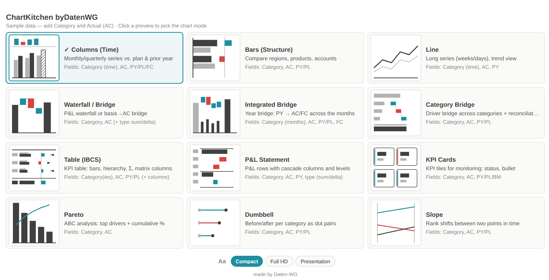
One Power BI visual with 13 IBCS-inspired modes — from columns, lines and waterfall to table, matrix and a full P&L statement. Understand in two minutes what the visual does, how to get going and where to find the full documentation.
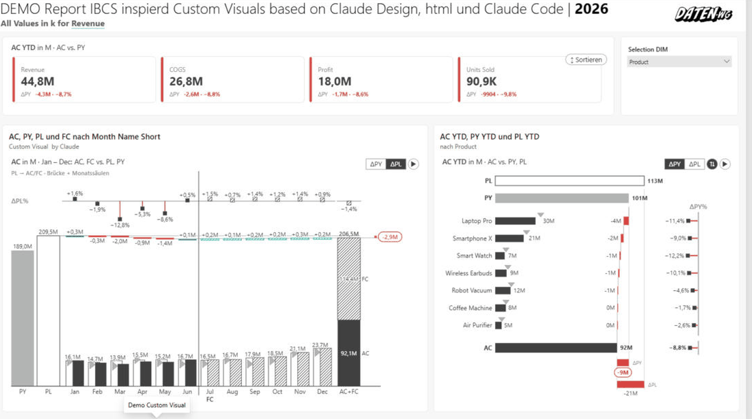
Direct download, no registration — this link always serves the latest release. Import in Power BI Desktop: Visualizations → “…” → Import a visual from a file. All builds are also available on GitHub.
⬇ Download ChartKitchenChartKitchen ships with something few custom visuals have: documentation written for AI assistants — the full data contract (field roles incl. pitfalls), all ~90 formatting properties with exact names and values for PBIR authoring, the persisted states (sort order, expand state, column widths), formula syntax, DAX rules and the known traps. With it, an agent — Claude, Copilot, Cursor & co. — can configure the visual correctly instead of guessing: complete report pages from a prompt, including settings you would otherwise have to click together by hand.
How to use it: ① Hand the guide to your agent — paste the link into the chat, drop the file into your project, or put it next to your CLAUDE.md/AGENTS.md. ② State the task (“report page: columns with ΔPL, YTD button, table sorted by ΔPY”). ③ The agent writes the matching configuration with exact property names — the guide also tells it what the data model needs to look like.
Direct link to paste into your agent chat: datenwgknowledgekitchen.com/ibcsInspiredChartDeck/AGENT-GUIDE.md · also on GitHub. The guide itself is in German — every capable agent reads it fine; an English edition may follow.
01Get going in three steps
From the import file to a finished IBCS chart — two or three fields are enough for the first diagram.
Import the .pbiviz
In Power BI Desktop, in the Visualizations pane click … → Import a visual from a file and pick the .pbiviz file. The ChartKitchen icon appears and can be dragged onto the page.
Fill Category + AC
Assign your axis to the Category role and your measure to the Actual (AC) role. Landing tiles appear — click a mode and the visual draws it right away.
Add PY / PL
Add Previous year (PY) and Plan (PL). Variances follow automatically: absolute and relative variance panels sit next to or above the base chart with no extra work.
Every step in detail — import, minimal setup and field roles — is in the Quick start chapter of the documentation →
02Continue in the documentation
Each tile jumps straight to the matching section of the full documentation.
Quick start
Import, minimal setup and the field roles Category, AC, PY, PL — step by step.
Open →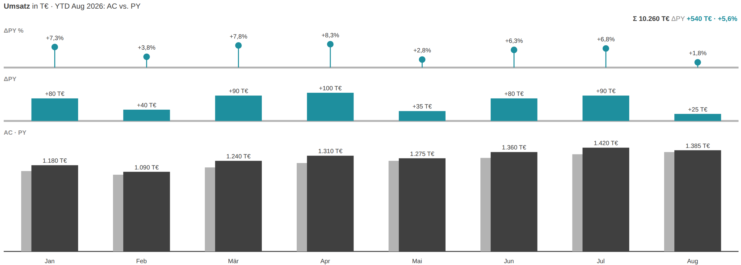
The 13 modes
Columns, bars, line, waterfall, bridge, table, matrix, KPI cards, P&L and more — every mode explained.
Open →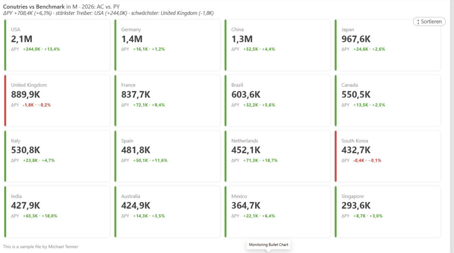
In action
Real Power BI examples: complete report pages, monitoring, comparisons and more.
Open →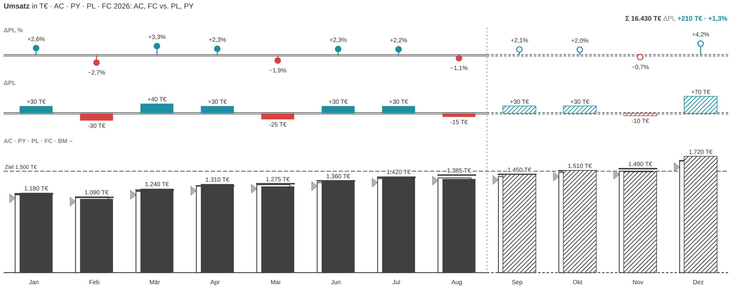
Features in detail
Scenario notation, small multiples, comments, cumulation, Top N and the remaining features.
Open →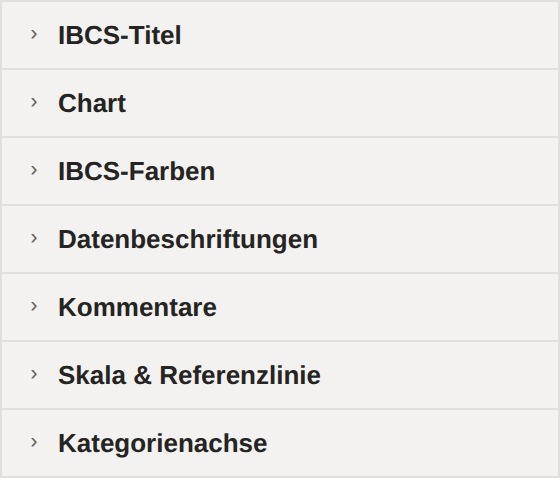
Settings reference
All 84 settings across seven format cards — with schematic sketches of the format pane.
Open →FAQ & troubleshooting
Common questions, typical pitfalls and quick answers around the visual.
Open →Docs as PDF (EN)
The complete English documentation as a PDF for offline reading and sharing.
Get the PDF ↓